Amazon

Friday, March 9, 2012

SPX, BKX, and Dow Updates: Market Potentially at a Major Pivot

As I said yesterday: the market's not doing anyone any favors right now.  After playing around with a number of indices, the short term waves can be counted pretty much however you want.  The market is in something of a no-man's land right now.  I finally just handed the chart to Johnny and asked him what he could make of this (see below).


This is one of those times it would be really nice to have some more info from the market before attempting to make a solid call. 

Tomorrow is a non-farm payroll day, and 8 of the last 9 NFP days have been red.  The market also has a tendency to reverse from whatever direction its heading when the report comes out.  So bears probably want it to be heading higher when the report is released.  Bulls want it to be heading lower.  And Leon's getting laaaaaarger.

Of those 8 recent red NFP days, 50% of them have marked fairly large turns lower.  Also of note, Dr. Seuss's favorite chart ("One Rectangle, Two Rectangle, Red Rectangle, Blue Rectangle") is still within the potential blue rectangle turn window.  Some readers may remember this chart from way back on Sunday:


I remain barely in favor of the market having made a turn at 1378.  But any trade above that high would make a run into the 1400's almost a given.

I took a crack at a lot of charts tonight, and want to lead off with the Dow chart, because it does provide a cleaner possible way to count the rally of the last couple days as an a-b-c.  The SPX chart which I'll share after that... not so much.  What happens today/Monday should be hugely helpful in sorting out the larger counts.

In a moment I'll explain why I remain slighly in favor of the more bearish count, which is still almost a coin toss, in my opinion.


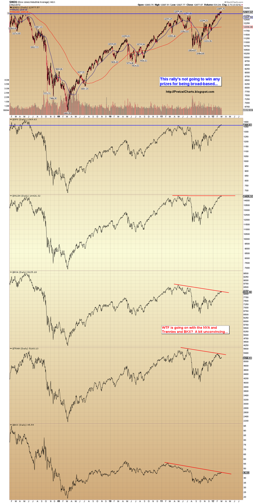
So why do I remain slightly in favor of the bear count?  Well, in part it hinges on the BKX charts. But even those aren't clear-cut -- because the BKX bearish count in turn hinges on the idea of a failed wave (v) of 5.  If the price high is the actual high for wave 5, then the decline was a clear a-b-c correction.  If the failed fifth is correct, then the decline is a clear impulse.  It's a tough call; see for yourself.  Here are the charts for BKX. 

The short term chart (first) shows a clean 5-wave decline.  The question is whether it's wave 1 (or a) or wave c of 4.  The second chart shows why I think it's 1 (or a).


As can also be seen in the big picture BKX chart, another decline leg could still unfold before the rally resumes (gray "alt: (iv)" label).  That might be a good option to help the market screw everyone.

Next, the SPX leading diagonal count from yeterday.  The short-term labeling shown here feels like a stretch.  If this count is playing out, the wave labeled iv could also be wave a.  The potential ending diagonal highlighted (converging blue lines at the top of yesterday's move) does look like it needs another small wave up to complete.


The next SPX chart (below) shows the more bullish labeling.  The good news is that if the market breaks out, there are a number of potential trade triggers in formation, and there should be some decent money to be made on the long side.  The other good news is that the bearish count invalidation level is only 10 points up, so there could be an answer soon.

The chart mentions the island reversal bottom which occurred with yesterday's gap up.


There should be a good trade-able pattern developing if the more bullish count plays out, and I'd recommend taking longs at some point if the bearish count is invalidated.  I'm almost rooting for the bull count, because it should be "easier" money.

In conclusion, the market seems to be at an important pivot.  A break above the recent highs should carry the market into the 1400's, and possibly even into the mid-to-high 1400's.  If the bear count is playing out, there may be an important top under construction.  We should have a clearer answer soon -- and always remember: cash is a position too.  Also keep in mind the NFP info discussed earlier. 

And if you have any questions, just ask Johnny.  Trade safe.

The original article, and many more, can be found at http://PretzelCharts.blogspot.com

Thursday, March 8, 2012

SPX Update: Market Not Doing Anyone Any Favors

Yesterday, the preferred count expected a bounce, which we got.  Problem as I'm writing this is that ES futures are up about 9-10 points. 

As I mentioned in the body of the article yesterday, the wave iv target could run all the way up to the gap fill, although in looking back at yesterday's chart, I didn't quite draw the target box to match that statement.  This is another reason it's important to actually read the articles, although the people who just look at the charts will no doubt miss this portion of the article suggesting they read the articles.  Catch 22.

Maybe if I say it really loudly:  HEY YOU FOLKS WHO JUST LOOK AT THE CHARTS, READ THE ABOVE PARAGRAPH.  There.  Certainly made me feel better.

Anyway, if this 9-10 point ES rally sticks, while a big retrace is not outside the realm of possibility for the fourth wave as counted yesterday, it's less likely because it will break the top line of the 1-3 trend channel (not shown).  So today I'm going to lead off with another potential short-term wave count. 

The count below would be yet another head-trip from this market to add yet more confusion to the fire.  Or fuel to the fire, as the case may be -- I guess confusion doesn't burn too well.  "Add more fuel to the confusion fire" sounded dumb though, so I had no choice but to mix metaphors.  Looks like the shoe's on the other hand now!

I really can't blame the people who just look at the charts.

This is an entirely new option shown below.


And here's yesterday's chart, which discusses the short-term invalidation levels, and shows some ST support/resistance zones.


And next, the bigger picture SPX chart, which didn't show the alternate count yesterday, so I've updated it. 

As I talked about at length yesterday, there was nothing in the decline which should lead one to become ultra-bearish.  There are still numerous possibilities on the table, and until the market confirms a larger impulsive structure to the downside, it's entirely possible that there are new highs still coming.


Even with the rally in ES tonight, the odds still favor a new low for this move, for a number of reasons:

1)  It's challenging, though not impossible, to count the decline as a complete wave.
2)  Declines with the level of momentum displayed on Tuesday rarely mark the exact bottom of a move.
3)  Tuesday had very high levels of distribution which, again, rarely marks the exact bottom of a move.

So the odds still favor a new low for the move, and thus a sell-able bounce.  Of course, there are exceptions to every rule -- so these things are merely probabilities, which is all we ever have to work with as traders.  Trade above the 1378 high would negate all downside projections.  Trade safe.

The original article, and many more, can be found at http://PretzelCharts.blogspot.com

Wednesday, March 7, 2012

SPX and NYA Updates: No Holy Grail Just Yet

Yesterday went as well as a day can for numerous targets... and while it's still a bit tricky for the bigger picture, the very short-term charts seem fairly straighforward.  I'm going to lead with the short term chart, which expects that SPX is due for a bounce before it makes new lows.  After that, we'll discuss the bigger picture some more.  Then we'll remove our brains from our heads and toss them around like footballs, because they probably won't be good for much else.  I know mine certainly isn't.

I apologize for the size of the wave iv target zone, but the real blame falls on the market -- due to the length of wave iii, there's a lot of room for wave iv to play around in.  It could stop near the wave (4) high, or it could bounce all the way up to fill the gap.  Either way, I do expect that new lows will be made after this bounce is over.


The next chart is a conglomerate of markets, and shows that the Trannies are now in a key overlap range, but so far most everything else is still holding the uptrend line off the October lows.  (Again, if you right click the chart and select "open in new window" you can bring up the larger chart.)


It's probably not advisable to get ultra-bearish just yet.  I know it's very tempting after a day like yesterday to go all-in on the short side and throw caution to the wind -- but as you can see, the majority of markets are still technically in uptrends.

Yesterday, I talked about the likelihood that this was a wave 4 decline, with new highs to come.  That's still quite possible, but I'm now leaning toward the idea that the 1378 print high may have been more significant.  Just barely.  Leaning, that is.

After having more time with the NYA chart, I've changed the labeling a bit... and under the new labeling, the rally counts as a potentially complete waveform.  First the big picture, then the 30-minute chart.  The alternate count is shown in black.  I'm about 55% to 45% in favor of the red/blue count at the moment.


The next chart is simply a daily chart of the Dow Industrials, which shows some support/resistance lines and takes all the noise out of the count.  It also shows how this could now be counted as a complete waveform. 


Finally, a look at the SPX 30-minute, and a way to view the waveform as complete in that market.

A couple readers have asked me to elaborate a bit on why yesterday's revamp of the count was so potentially meaningful.  I mentioned it yesterday, but I think the significance was lost on non-Elliotticians.  The idea of a triangle in the count is quite significant, because it means that the odds heavily favor that this leg of the rally is the last leg (at least, at this degree).  Triangles almost always appear as the penultimate (second to last) wave in a waveform.  In other words, we wouldn't expect to see a triangle in that position if this were in fact the start of an impulsive new bull market. 

Now, that said, here are a few thoughts for bears to chew on.  The big one that keeps rattling around in my brain is the historical precedent based on the length of time this rally has gone without a major correction.  When a new year starts off as strongly as this one did, historically, the odds heavily favor that the year will end higher than where it started.  We also have seasonality still at work, arguing against the bear case, at least until May or thereabouts.

So, I'm definitely not advising mortgaging the house right here and throwing your life savings into puts.  As I stated earlier, while there are a number of encouraging signs for bears, but there's still no confirmation of anything -- other than a long-overdue correction has finally unfolded.

Again, I'm leaning toward the idea that this is the start of a bigger decline -- but, even if that's correct (in fact, especially if that's correct) -- then there will be plenty of time for bears to make money.  The market isn't going to zero tomorrow.  Right now, it's almost a coin toss in my mind as to whether the 1378 print high is "it."  If you didn't dip your toe in while I was suggesting the rally was putting in a top (of some form) there -- and prices were much higher -- it's probably advisable to sit tight and wait for a bounce or for confirmation... unless you're a day trader, obviously.

If one looks at the trendlines shown on the many charts above, the majority of markets are either at, or very near, probable support zones.

If this is the start of a much larger decline, confirmation will come eventually, and there will certainly be better setups to trade.  In the meantime, there's the short-term charts to work with.  Trade safe.

The original article, and many more, can be found at http://PretzelCharts.blogspot.com

Tuesday, March 6, 2012

SPX and NYA Update: New Discovery Changes Everything

Okay, I really have to rush now.  I literally had the entire update done, and at the last minute had a "eureka!" moment.  Despite the association with the popular vacuum cleaner, Eureka moments don't suck (rimshot).  But now I'm having to re-do everything, so it won't have as many charts as originally intended. 

Bears are going to love this.

Anyway, I have to really boogie to get this posted because, basically, I had to do two updates tonight.  I'm going to lead with the chart that led to the epiphany.  I've been wrestling with the first leg of this rally since it started.  It doesn't count well as much of anything for an impulse wave, and I have looked at it every which way I could, without anything jumping out at me as being "right." 

All of that changes right now, though.  With this new count, suddenly everything fits.  The chart below is the NYA -- the NYSE Composite Index.  I often like the NYA as a better reality check, because it's a much broader market representation. 

And here's the key realization:  the first part of the rally doesn't fit properly as an impulse because it's not technically part of the same wave.  Start with the big picture NYA count below, and it will all suddenly make sense.


Zooming in to the smaller waves, it looks possible that there could be another wave up left, if this is part of a 4th wave expanded flat unfolding now.  It is also possible that the market has topped, though it doesn't seem to fit the one-minute charts as well, since the wave labeled "alt. 5" looks like a 3-wave move.

In either case, a major top is either in place, or should be very close at hand.  This completely changes my expectation of another major leg up.  There may be one more leg up, but I don't think it will be the big leg I was expecting.  I'll have to revisit all that later today when I have more time.


As shown on the chart above, it does appear likely that there's still one more slightly higher high due, but I simply don't have time in light of this new count to go back and revisit everything right now in the detail I'd like to.  So, for the SPX, I'm going to suggest that bears watch the 1350 zone, and below that, the 1337-1340 zone for clues.  If this is a 4th wave unfoldiing, then both of those areas have the potential to mark the bottom. 

Below is a very short-term SPX chart which shows near-term support and resistance.  If the market doesn't hold 1350ish, then a drop to 1337-1340 looks promising since there appears to be an air pocket in between the two zones.


Yesterday saw the first material break of the 2-month trendline, which could mean the early stages of a trend change; however, this isn't uncommon to see during 4th waves.  I'm not going to put up the 10-minute SPX chart, because it doesn't really convey any new info, other than the trendline break, and I need to rework the count there.

However, I am going to show the RUT chart again, because this one seems to jive with the idea that this is a fourth wave correction at a smaller degree than previously anticipated for SPX.  I really like the way this all fits together now; I've literally been wrestling with it for about two weeks.  SPX is likely still in a fourth wave, but it's one degree lower -- and the next top should be a major one, if the NYA count is correct. 

Again, the top could be in place, but I view that as somewhat less likely at the moment.  Closer examination when I have more time could change that opinion.

In either case, what gives credence that the next top will be major, and that this whole move is an a-b-c (assuming the triangle is correct in NYA), is the fact that triangles are almost always b-waves or 4th waves -- and it's clearly not a fourth wave.  Triangles are almost never 2nd waves.


In conclusion, this is something of a game changer.  The short-term hasn't changed much -- it still appears most likely to me that the market will make another new high.  However, that new high should mark a major top, and the next trip will be a test or break of the October lows.

It is also possible that the turn is in already -- but based on RUT and NYA, the pattern still looks incomplete. 

I have to re-work a lot of charts later, but these are my preliminary conclusions based on what I've been able to examine -- and based on what my gut has been telling me for a while.  Until tonight, though, I couldn't figure out exactly how to fit all the puzzle pieces together.  Now they fit.  Trade safe.

The original article, and many more, can be found at http://PretzelCharts.blogspot.com

Sunday, March 4, 2012

SPX, Dow Cycles, US Dollar, Silver, DAX, NDX, BKX, RUT: Got Charts?

Not much to add to Friday's update -- ideally I'm still looking for some type of larger correction in the foreseeable future.  I spent an awful lot of time charting this weekend, so I'm going to spend more time sharing those charts and less time writing. 

The first chart is a view from the 10,000 foot level, and shows how the rally has been pretty narrow, which isn't usually how a massive new bull market would start.  A rising tide lifts all boats, as they say.  If you right click and select "Open in new window" (or tab), then click the chart once to zoom, you can see the chart at full-size.  This is a fairly large chart, and hard to see at Blogger's default size.


Next, a quick look at the German DAX, which is also still well off its 2011 highs. The trend seems to be weakening here as well.


Next the 10-minute SPX chart.  Not much to add since Friday.  This move could still have another down/up (or two) left in it -- as I said before, if it is an ending diagonal, they have a tendency to run "one more leg" than you thought.  The short-term structure remains a mess. 

The preferred count is still that a top of some form is now in place at the 1378 print high... but this count is only preferred by a slight margin.


Readers who aren't drinking heavily will note that the SPX violated its (assumed) 2-4 trendline in the chart above.  This is the first such trendline break since Jimmy Carter was attacked by a giant swimming rabbit.  Okay, maybe it hasn't been quite that long, but it feels that way.

If the 2-4 count is correct, then this break is a bearish signal.  However, below is an alternate way to view the trendchannel, which is still very much intact in this view.


Next a random chart, which I'll have to upload before I can comment on it.  I worked on so many charts, I don't actually remember what the point of the next one is.  Oh, yeah, it's the NDX melt-up channel, and shows three potential support lines.  The NDX did capture its 2650 target (on the nose!), which was mentioned a week ago.


The next chart is pretty darn cool.  I was doing some work with the Dow this weekend (we built a fence in my backyard together), and I seem to have found a fairly convincing time cycle buried in the price movement.  The boxes are all the exact same size, and very accurately measure the time of a move from various peaks to troughs.  The blue box/cycle seems to alternate somewhat between highs and lows, but the cycle always seems to land on one or the other.  The red box is clearly a low-low cycle.

Keep in mind that I didn't cheat these boxes at all -- they are all exact copies of one another, and the exact same size (well, the blue ones are all the same size as the other blue ones, and the red ones are all the same size as the other red ones.  The blue ones are not the same size as the red ones.  I figured I didn't need to explain that part... put the liquor away already!).

Assuming this cycle is still active (it has been since March '09), then this chart suggests a high is due very soon.  I should probably keep this chart secret... but what the hell, I'm in a generous mood.  Plus you probably won't remember I showed it to you anyway, with all the drinking you've been doing.


Next the big picture US Dollar.  Note the gray alternate labels.  The possibility of a large a-b-c still can't be ruled out. 


And the intermediate dollar chart.  The recent low sure has the look of an IT (intermediate term) low, and the dollar has closed back above its important trajectory level.


Next, silver.  Silver could be in the early stages of a fifth wave up at Primary degree -- alternately, it could be forming a double-zigzag to new lows.  In both cases, further downside appears likely over the mid-short term, though it's likely to correct upwards a bit more first -- perhaps a back-test of the red/blue trendlines.


Next the BKX, which also appears very close to finishing a complete 5-wave rally.


Next the updated RUT chart.  RUT broke down from its rectangle, which was mentioned on Friday, and is now targeting 788/789.  As long as RUT remains below the breakdown level (approx. 810), the target remains active.


It's also important to look at the bigger picture RUT chart, which shows major trendline support is just below the target area.  If you took that breakdown trade, it seems ill-advised to get too greedy after the target is reached -- assuming it is reached, of course.


In conclusion, the red boxes are not the same size as the blue boxes! 

Also, it still appears likely that a correction is due in the near future -- the question is whether it's already started, or whether there's more upside coming first.  Again, because of the ambiguity of the wave structure at the start of this rally, and the ambiguity in the short term structure right now, there are still several possiblities for the ending  -- and for that reason, I suggest traders pay close attention to the support and resistance levels and the trend channels.  There is a lot of evidence which seem to support the conclusion that this is a fifth wave -- but this rally has surprised us before.  So trade safe.

The original article, and many more, can be found at http://PretzelCharts.blogspot.com

Friday, March 2, 2012

SPX and RUT Updates: Avoid Trading Only Your Bias

Yesterday's upward reversal gave the decline off 1378 the look of a three-wave correction, so unless it's part of an expanded flat or similar, this pattern is suggestive of higher prices. 

Interpreting this market with any confidence remains challenging.  On the one hand, the preferred count seems to be playing out fairly well -- but on the other hand, I keep thinking "fourth wave" every time I study this move.  The biggest challenge is that the first portion of this rally, back in December, is very ambiguous.  So I'm not entirely certain how many nested first and second waves need to unwind at this point. 

This is pretty normal -- the counts go through phases where they're pretty clear, and they go through other phases where they're open to interpretation.  This is one of the "open to interpretation" phases.

My preferred count is still that the SPX has either completed a fifth wave or nearly completed it.  If it's an expanding ending diagonal, it completed at 1378 (first chart).  If it's a contracting diagonal, it needs at least one more move up (second chart).  Both charts below.


Diagonals can be a pain in the butt and will sometimes run "one more wave" longer than you think for several days. Hopefully, that won't be the case here. In a perfect world, if it's a contracting diagonal, the move described on the chart below would happen today.


Next the 10 minute SPX chart.  The SPX has yet to break down from its uptrend channel, though it has been spending time in the bottom half of that channel recently.


The next chart is the Russell 2000 (RUT), which has a nice trade-able rectangle pattern. 

I know a lot of my readers are bears, but it's important not to get too hung-up on one's "convictions."  For example, a week ago, I pointed out an ascending triangle in the NDX, which targeted 50 points of upside if it broke out.  It has since broken out, and so far, the NDX has captured 45 of those points to the upside -- that's $900 profit per NQ contract.

Another example would be when the SPX back-tested the 1300-1310 zone.  Since then, with the exception of a misfire that cost about 5 points from 1328 to 1333, I've been predicting higher prices up until very recently.  To be quite conservative, let's call it 40 SPX points of upside -- that's $2000 profit per ES contract. 

I bring these two things up to illustrate why I would strongly recommend that bears don't overlook these types of patterns in favor of trading only their biases.  Let the market tell you what to do. 

This rally could go on for longer than most bears are expecting, and if the SPX ends up topping at 1487, you don't want to look back and see that you've missed every cent of action on the long side due to your bias.  Or worse: lost money because you were only willing to short.  I am, of course, not addressing day traders as much as swing traders.

Anyway, back to the RUT.  I prefaced the chart with the above discussion because it shows a rectangle that could be traded long or short, depending on how it breaks.  If the SPX count is correct, it seems probable it will break down -- but why try to anticipate a pattern that's this clear and simple?  Trade it whichever way it breaks.  Or, conversely, trade it as a range: short near the top of the range, long near the bottom.  Either approach can work, because the breakout/breakdown levels are pretty clear, so the market tells you when to stop out of the trade if it's not working.

From an Elliott perspective, the pattern in the blue rectangle is almost impossible to count, but it certainly appears corrective.


Next is a long-term Dow chart, which simply shows some support and resistance levels.


And finally, a chart I found interesting.  Long-time readers know I like to study ratios of various markets.  This chart compares the ratio of Rydex 2x bull funds to Rydex 2x bear funds.  This ratio usually tracks the SPX pretty closely, but has recently launched way out ahead of the SPX.  I like to study Rydex funds to get a feel for the mom and pop investor sentiment, and this chart confirms that small investors (dumb money) are exceedingly confident in this rally. 

It's only come close to being this far ahead of the SPX one other time, noted on the chart.  But so far with this rally, dumb money has been winning this battle for a while.  Don't blame yourself too much if you've been skeptical of this rally:  based on a conglomerate of indicators, smart money has remained skeptical over dumb money by a 2 to 1 margin for some time.


In conclusion, if the short-term wave counts are on-target for SPX, there's a good chance the market will correct soon.  Either the market holding below the recent 1378 high or a false break above 1380 which whipsaws would be acceptable conclusions to this wave, based on the preferred count.   The caveat is if the market can break above 1380 and sustain that break, then the preferred count is incorrect and bears should get out of the way -- if that happens, then a run to 1400-1410 is probably unfolding.

Recall that the SPX has yet to so much as break its uptrend, so bears shouldn't get too excited yet.  Personally, I love trading diagonals in the way described on the second chart.  If there's a false breakout and whipsaw, there are usually only a few points at risk to attempt that short.  If it fails, you're not risking much -- but if it plays out, it's usually almost the exact top.  Traders looking to play either side of the market should also give some consideration to the RUT.   Trade safe.

The original article, and many more, can be found at http://PretzelCharts.blogspot.com

Thursday, March 1, 2012

SPX Update: Was That It?

For several weeks, I've been talking about the Fib zone at 1376-1378 and how I felt that could act as a magnet for the rally.  Yesterday, the SPX hit 1378.04 and reversed.  Could it really have been that simple all along?  There's no way to know for sure yet, but the market has now satisfied the requirements of the preferred count's 5th wave up -- and it may finally be time for the larger correction bears have been waiting for since Santa was in town. 

Even though the market only closed down a handful of points, yesterday had a lot of things going for it to give bears some hope: 

1.  Yesterday formed a bearish engulfing candle in SPX
2.  Commodities took a beating. 
3.  The dollar formed a bullish engulfing candle.
4.  The ECB "anticipation" is over.  Sellers don't have to be scared of it anymore.

There are a couple ways to view the very short term structure, but I'm sticking with the expanding ending diagonal as the preferred count.  This count says the top is in, though it may not be the monster top bears are hoping for -- I'll discuss that big picture outlook in more detail in the final chart.


The wave structure at micro degree is a total mess, so it's also possible this is part of a contracting ending diagonal with one more new high to come.  Below is the alternate short term count.  I like the preferred count better, for the reasons previously mentioned, but the only way to rule out the alternate is with trade beneath 1352.28.  Normally, I'd use the wave (ii) bottom, but the structure's messy enough that I'm allowing leeway for counting errors.

If the alternate short-term count below ends up playing out, it's fairly common for wave (v) to overthrow the upper trendline in a false breakout.  If that happens and it keeps rising, bears should get out of the way -- but if that overthrow happens and the market then breaks back below that upper red trendline (whipsaws), then that's an excellent place to get short with stops at the newest highs.


Now, if the alternate count shown above is invalidated, it does not mean with certainty that the preferred count is correct.  These are not the only two options for this market.  Because of that, I'm recommending that the support and resistance lines on the 10-minute chart below be used as better trade indicators.  Yesterday, the market closed right on trendline support.  Below that, the next important support comes in near the 1352-1355 level, then at 1337 below that.  The blue line is overhead resistance, as are the recent highs.


Finally, the big picture count below.  The preferred view is that wave (iii) is wrapping up, and the market is now entering a fourth wave correction, with another leg up still to come. 

There are two big picture alternate views I'm considering.  The first alternate (shown in gray on the chart below) is that the market is actually now in the process of forming a major intermediate top, and from here would head down to test or break the October lows.  I would give that count maybe 40% odds vs. the preferred big picture view.

The second alternate (not shown -- for the 2nd alternate, see the last chart in this article) is that the market is in the process of forming a very large ending diagonal (c) wave.  In that 2nd alternate scenario, the market would bounce around significantly, but still remain above the October lows for some time. 

Final confirmation of trend change occurs at 1267 SPX.  So the market could conceivably fall 100 points, and still be in a larger uptrend.  It's also important for bears to note the three rising trend lines, which should theoretically act as support -- although neither the blue nor black line have been tested recently.


In conclusion, there are reasonably good odds that we are on the cusp of at least a short-term trend change.  This was the zone we've anticipated for most of the month, and the micro structures now seem to be confiming the larger wave count we've been watching since February 8.  The supporting evidence across other markets is encouraging as well. 

There are no clear invalidation levels right now, but the support zones are pretty clear.  If you didn't get short at the Fib 1376-78 target yesterday, then it's usually advisable to wait for a retrace rally before shorting, since most half-way important tops are retested.  Conversely, one could play off of the support and resistance zones, using them as entry and exit/stop loss points.  Trade safe.

The original article, and many more, can be found at http://PretzelCharts.blogspot.com