Amazon

Wednesday, July 11, 2012

SPX Update: Market Reaches Critical Decision Point

Yesterday, I took an educated guess at the short-term path the market would follow, and, a little bit to my surprise, it followed the path I laid out almost perfectly.  It's now decision time for this market.  I continue to feel that a new high above 1374 would fit the pattern better -- and there are some signs that the bulls still have control of this market.  The decline did not come close to matching the furor of the last rally leg, and has been quite orderly.  This fits the pattern of a corrective B-wave decline. 

The market has nearly reached the lower boundary of the trend channel, and this is where bulls need to make a stand and turn things around if they want to maintain their hopes for new swing highs.  If the market fails to bounce here, we could start to see some real fireworks from the bears.

I find it interesting that the charts have reached an inflection point just in time for the release of the Fed minutes on Wednesday.  One could see things going either way with that news release (and with the charts) -- lots of QE talk could provide the thrust for that last high; lots of QE opposition could provide the thrust for an actual 3rd wave decline.  In fact, I recall that the Fed minutes, and perceived lack of support for a new QE program, seemed to be a factor near the last cyclical market high.

Funny how that works, though -- the charts are clearly approaching a decision point... and once again, it lines right up with potential "game changer" news.  It is also interesting that the pattern is ambiguous enough to allow for either outcome.

For the short-term, the pattern would look best with a slightly lower low, followed by a solid bounce.  The lower low isn't required to complete the pattern, however -- but the ideal target for the decline (assuming it isn't the more bearish alternate count) would be roughly 1333, which also "just happens" to line up with the lower blue trendline.

Another factor which favors the bulls is the strength of the rally vs. the strength of the decline.  Note how much more headway the bulls made in a few days than the bears did -- this suggests the bulls still have firepower.  However, sustained trade beneath the blue trendline would begin to shift the odds in favor of the more bearish alternate count. 


Regardless of which short-term resolution the market has planned, the intermediate picture currently only has one preferred outcome, and that is for the market to head into the 1100's.  It would literally take a moon-shot from the market, right here and now, to change this pattern into something bullish -- and that currently appears to be very low probability.


For contrast, the bigger picture chart below has been labeled with the alternate count, and also outlines a very bearish pending sell trigger.


In conclusion, the overall pattern would still look better with a new high above 1374, the first target for which is 1375-1380.  In a perfect world, I'd actually like to see a new high that slightly overthrows the upper line of the bearish rising wedge shown in the chart above.  However, the market has reached a critical inflection point now, and the bulls do need to turn this market fairly quickly to maintain their short-term hopes.  Trade safe.

Reprinted by permission, copyright 2012 Minyanville Media, Inc.

Tuesday, July 10, 2012

SPX and RUT: The Yuck Market


This remains a yuck market.  While one could get lucky and guess exactly right about what's coming next here, I don't think this market is at all clear-cut at the moment.  In my opinion, the majority of Elliotticians tend to advance wave degrees too quickly and declare corrections (or impulses) over too soon.  If they're bearish, they'll tend to be early on tops and assume the next big wave down has started (I am sometimes guilty of this myself) -- if they're bullish, they'll tend to do the opposite. 

Some Elliotticians have assumed that wave (iii) down has started already, and I continue to accept that this is indeed possible -- but I feel it's less likely, again based on the best evidence provided by other indicators.  As always, it's all about probabilities... so 60% probabilities will still be wrong 4 out of 10 times, and a strong break could always show up tomorrow -- but on Friday I warned that I felt the market was entering a chop zone, and so far that's been the case.  Unless it breaks down strongly here, I currently see limited evidence for a higher degree third wave decline yet.

The first chart I'd like to call attention to is the RUT, which again argues for a choppy correction to be followed by new highs.  While SPX presents more clearly as a double-zigzag series of ABC's, RUT looks more like a nested (1) (2) series that's in the process of forming wave C.  It could still be a double zigzag, but going with the "trade what you see" philosophy, I don't think the double zigzag works as well.

What I especially like about the RUT chart is the clarity of the invalidation level for a fourth wave decline, although keep in mind that this would not invalidate a double zigzag.  Bears should watch for a clean break of the rising trendline as a possible sell signal, since most double zigzags will maintain a pretty clean channel.

Whether one calls the RUT pattern a double zigzag or a nested C wave, it is darn near impossible to view the upwards movement as complete.  The only way that becomes possible is if one views the first 3-wave-looking structure as a really ugly A wave with an extended fifth.  Again -- always possible... I'm just working off the probabilities here.  Also note the gap open off the 820 high that gives bulls a target to aim at.


The next chart is the SPX, which could follow a similar path.  The complexity of the correction in RUT and SPX isn't required to play out as illustrated, this is simply a SWAG (an educated guess) as to how things might play out.  R2 is key resistance on SPX, and sustained trade above 1363/64 would favor the odds of a new high being made more directly.


In conclusion, the odds favor further chop with an eventual upwards resolution, to be followed by a major turn lower.  Barring that, a strong breakdown of the upward-sloping channel would shift things more immediately into the bears' favor.  Trade safe.

Reprinted by permission, copyright 2012 Minyanville Media, Inc.

Sunday, July 8, 2012

SPX, INDU, and GOLD: Still in the Chop Zone, but a Turn is Expected Soon

Heading into Friday there were several options on the table, and it appears that the favored option of an expanded flat (as illustrated on the Dow Industrials (INDU) and S&P 500) may have been the option that played out.  The second target of 12715 was reached and very slightly broken. 

Nobody likes an unclear market, least of all me (it means I have to draw extra charts!), but that's exactly what this is -- at least for the short term.

Based on the current big picture charts, I continue to favor the view that an intermediate trend change occurred near 1422 and that the trend is now down.  The S&P 500 (SPX) was able to briefly trade and close above the key 1370 level, however that came on a light holiday session and was reversed immediately.

Last week, we discussed a number of signs that the market may be topping, including the McClellan Oscillator (NYMO -- which reached an extreme overbought level), and the up volume/down volume ratio on the NYSE, which suggested very minimal buying interest at the recent swing low.  We have also discussed some signals which suggest that the market could still form a higher high -- such as the Advance/Decline momentum, and the Relative Strength Index (RSI) momentum.  These messages are not really at odds with each other, because the NYMO tends to be more of an intermediate sell signal, whereas the hourly RSI tends to be more of a short-term signal.  But it does make boxing the short-term outlook a bit difficult. 

On Thursday, I noted the possibility that the top was in, and that remains entirely possible, especially after the solid down market on Friday -- but from a short-term perspective, I believe the odds still slightly favor a new high coming (call it 60% in favor).

With the short term outlook a bit sketchy, sometimes it helps to step back and view things from the 10,000 foot level... so the first chart I'd like to share is the NYSE Composite (NYA), which presents a different picture than the SPX and INDU.  With the NYA still unable to reclaim key resistance, it is difficult to be long-term bullish on this market.  An interesting difference between the NYA and SPX is the much-broader NYA shows declining peaks beneath the 2011 highs, suggesting that NYA's intermediate down-trend actually began in 2011.  A solid breakout above the upper red trendline would be the first step toward changing the outlook here.


As discussed, the market has kept its short-term options open.  I'd like to start with the Dow Industrials, since I feel the pattern is slightly more clear there.  I would expect SPX to follow a similar path. 

There is a certain amount of tolerance built into the system, and blue wave b is not required to be complete at 12703.  It would be acceptable for the market to head a bit lower before heading higher.  The broader take-away here is that the charts still suggest a new high could be made on this leg, but I currently would not expect it to break the prior cycle high of 13338.

The main thing bothering me about the idea of a new high for the indices is the fact that major turns usually come when everyone is looking for another new high.  So it would not surprise me in the slightest if the top was in already, as discussed Thursday. 


While the short-term picture on SPX remains cloudy (first chart below), the intermediate term projections have changed very little since late May (second chart below).  Again, over the short-term, a lower low and reversal would be well within acceptable tolerances for the broader count, but any trade beneath 1306 should rule out the prospect of new highs.

Short term:


Intermediate Term:


Solely for the sake of reader visualization, I have also drawn up a simple chart of one of the short-term options that is still on the table.  This isn't a prediction so much -- it's more of a warning and for trader awareness.  The possibility of an ending diagonal here is reasonable.  It could unfold similar to what is shown, but at this point, it's impossible to put a bead on it (if it even happens to begin with) because the market hasn't yet established the converging trendline boundaries.  So, take it for what it's worth -- I'm simply showing it now because I can't be there with you during every minute of the trading day.  :)


Finally, a quick update on gold, which a number of readers have asked for recently.  The wave count here is unclear, so instead of focusing on the waves, I've focused on more basic technical analysis and presented some intermediate bullish and bearish trade triggers.


In conclusion, the market is still in the "chop zone" I warned about on Friday, and its next short-term move is a bit unpredictable.  Based on the current charts, I continue to feel that the intermediate-term will bring a significant sell off once the (assumed) wave (ii) peak is in place.  This should begin sometime during the next week or so (again: assuming it hasn't already).  The outside shot for a more bullish intermediate term resolution cannot be fully discounted yet, but continues to appear much less likely based on the market's recent signals.  Trade safe.

Reprinted by permission, copyright 2012 Minyanville Media, Inc.

Friday, July 6, 2012

SPX and INDU Updates: Choppy Market Expected


NOTE: Since this was published, ES has dropped 10 points.  If this holds through the open, we can rule out the ending diagonal and the triangle.  This would leave the option of a flat, or the option that the top is in, as discussed yesterday.


There's been no material change in the outlook since yesterday (please see yesterday's article for the big picture options).   Nevertheless, I have wracked (or possibly "racked") my brain -- or what's left of it anyway -- and scoured the charts in an attempt to find some indications of short term direction.  I found some clues in the Dow Jones Industrials (INDU), and I've diagrammed a couple options and some levels so readers can have some idea of what to watch for after the open on Friday.

I believe the key clue in INDU is the new price high on Thursday, which was made by what appears to be a 3-wave rally.  This is highly suggestive that the final high isn't in yet (no guarantees, of course, but odds favor this), though there are a couple paths the market might take to get there.  I've sketched the two most likely short-term paths into the chart below.  Both suggest the final high isn't in yet. 

Note the perfect mini-fractal of an expanded flat (in the red box). 


The S&P 500 (SPX) is trickier, because it's left the option of a triangle on the table -- however, the INDU suggests the triangle is less likely, since the two usually track in a similar fashion.  Thus, the two most likley paths for SPX are the same as INDU.


I've diagrammed the SPX diagonal on a separate chart (below).  The ending diagonal may have one, or two, more swing highs left in it: it's a bit unclear, but the pattern suggests two.


In conclusion, it appears that we may be in for some sideways chop for the next session or three.  There are suggestions that the final highs are not in yet, but also suggestions that the rally is nearing a top of some kind, and a forthcoming larger correction.  If this short-term outlook is correct, this is the type of market that can ground up short-term traders who are looking for a trending wave, and this can be very damaging to one's account.  Hopefully, the options outlined will help keep readers from getting ground up in the expected chop.  Trade safe.

Reprinted by permission, copyright 2012 Minyanville Media, Inc.

Thursday, July 5, 2012

SPX and Euro Updates: I've Run Out of Sub-Headings

This article lacks a sub-heading because I've been staring at my screen for 20 minutes, and I can't think of a good one.  The things that keep popping into my head are totally inane.  Sub-headings such as:

SPX and Euro Updates:  Stop with the Kicking!
SPX and Euro Updates:  Hey... THOSE Aren't Pillows!

So we'll just have to go without.

The rally continued into the fourth of July holiday, marking its 3rd straight day of gains... which brings an interesting historical fact to bear:  Going back to 1965, the market has risen 3 consecutive days prior to July 4th on 9 previous occasions.  In 8 of those 9 instances, the next trading day closed in the negative.

That historical precedent, coupled with the fact that the McClellan Oscillator (NYMO) (which, as I mentioned on Monday and Tuesday, is extremely overbought), suggests a pullback is due.  However, the odds now favor a continuation of the rally after the pullback.  The up momentum has been strong, as measured by RSI readings (chart later) and the advance/decline line (not shown).  Normally, after such a strong thrust upwards, there is some residual momentum that carries the market up to new highs after the first pull-back.

Further, the market was able to break and close above the 2011 high of 1370.  Granted, this came on a light holiday session -- so we'll see how the market behaves afterwards.  The wave could be counted as complete, hence the (ii)? label at the 1374 high.  These types of waves are tough to count, though, and I'm hesitant to suggest a top here, based on the info currently in the charts.  So... barring an immediate and strong reversal, the odds are starting to favor the higher target of 1406 being reached and possibly even breached.


The more bearish big picture count remains favored for the time being, but there's simply not much for bears to get excited about at the moment -- and this is the type of rally I would suggest not be front-run by inexperienced traders.  If you know where to jump in and out, and are good with your stops, then by all means, have at it.  But if you're someone who has a hard time letting go of a losing trade, and/or a hard time protecting profits, this might not be the type of rally to try learning the ropes trading counter to the current trend (which is up, in case you've missed the up-sloping channels drawn on the charts for the past several sessions).

Note the RSI (top panel) on the chart below, which made a new high along with the recent price high at 1374. This suggests that momentum is still strong, which suggests that the final high isn't in yet. This doesn't always work, but it works the majority of the time.


In keeping with my promise to consider the more bullish potentials if 1370 was broken, the next chart shows the big picture bullish count.  This count remains the alternate for the time being, but as I've stated in the chart annotations for several days, bears need to be on the defensive as long as the market remains within the uptrending channel.


For traders who would rather short things than go long, perhaps one should consider switching to the euro/us dollar currency pair.  The euro has been in a solid down-trend for a long time, and has now back-tested a massive head and shoulders formation that projects a target south of 1.10.  This target is active as long as the euro remains beneath the lower trendline. 

Long-time readers will recall I suggested the euro as a possible short candidate on April 29.  As yet, I see no reason to cover those shorts.

One can see that since Spring-2011, this has been a much more consistently solid short opportunity. (Zecco Forex, one of my sponsors, offers quick and easy account setups and funding via credit card -- please use my link if you sign up. Many thanks! This is not trading advice.).


In conclusion, the short-term trend remains up for the time being; the intermediate down-trend has been broken and is now neutral (the bulls still have some work to do to change it from neutral into an intermediate up-trend), and the long-term trend is still up.  Despite these obvious facts, for the time being, I still favor the view that this is Minor Wave (ii) and that it will peak shy of the 2012 highs.  That outlook is subject to change with changing market conditions, of course. 

In the meantime, the odds favor a pullback on Thursday  (8 out of 9 instances is pretty solid odds -- but please remember that I don't create the odds and historical facts, I just report 'em -- so if they fail this time, don't blame the messenger!) and possibly into the next few sessions, and then a continuation of the short-term uptrend -- again, barring an immediate and strong reversal.  Trade safe.

Reprinted by permission, copyright 2012 Minyanville Media, Inc.

Tuesday, July 3, 2012

SPX, NYMO, RUT: Market Extremely Overbought


Odds are very high that this rally is about to take a breather.  The shape of the next decline, and the price points that the next decline does (or does not) overlap, will tell us a great deal about whether or not the trend has changed to bullish at intermediate degree.  Currently, the rally still fits within the outlook for a bearish intermediate trend quite well, and I do not as yet see a reason to shift outlooks.  As always, though, the market is the final arbiter.

There are four signals suggesting that the rally is nearing a potential turning point.  The first is the 1368 target, which was nearly reached on Monday.  The second is that the McClellan Oscillator (NYMO) is now extremely over-bought.  The third is the structure of the rally counts as a complete, or nearly complete, wave form.  And the fourth is the pending face-off versus the overhead resistance level of 1370.

Since the S&P 500 (SPX) has, as yet, done nothing to invalidate the outlook suggested by the apparent five-wave decline from the recent cycle high, the odds still favor a decline to new lows after this rally turns.  And unless the market prints a new high north of 1422, the pending intermediate target in the 1100's is still active.


I suspect we are extremely close to a turn.  Below is the McClellan Oscillator (NYMO), which has reached levels that have preceded turns in the past.


Next, a chart of the RUT, which counts a bit differently than SPX.  RUT's form highly suggests that the first wave up had an extended fifth wave.  It is now approaching the level where wave c will be equal in length to wave a.


Finally, a long-term weekly chart of the SPX, just to help everyone keep things in perspective.


In conclusion, the odds heavily favor a turn lower, coming in the extremely near future -- likely as soon as the next session or two.  If the bear case still holds water, it should be a significant turn -- but we'll watch the next decline carefully to see if the outlook has changed.  And finally:  Happy 4th of July!  Trade (and drive!) safe.

Reprinted by permission, copyright 2012 Minyanville Media, Inc.

Monday, July 2, 2012

SPX Update: Friday's Big Rally Accomplished Nothing

The strength of Friday's Euro-zone Celebration Rally surprised everyone, me included.  But before I get into the current potentials and some levels to watch, I want to address a related topic first.  While the vast majority of readers seem to "get it," there's a fundamental misunderstanding about my analysis that seems prevalent among a small minority of readers -- I'd like to address that misunderstanding in this article.

Market analysis is, first and foremost, about interpreting potentials and probabilities.  There is no such animal as a "sure thing" when it comes to trading and investing.  The analysis I favor, Elliott Wave Theory, allows me to look at the potentials within a given situation and project related probabilities: "If the market does X, then it's likely to do Y."  Again, these projections are probabilities; they are not guarantees.

Veteran traders understand this, but for the less-experienced traders, the best parallel I can think of is poker.  If one has ever played poker, then one understands that, over time, probabilities work out according to the law of averages.  A good hand can win 15 times in a row, then lose spectacularly on the next 6 attempts.  This is why I've stated that one must never trade as if the system they use is perfect: no form of analysis is perfect because probabilities are not perfect -- thus all forms of analysis are subject to some degree of failure.  Beyond that, I'm not perfect -- so sometimes I simply misread the probabilities.  But even if I could somehow read things perfectly every single time, the analysis would still fail at times; it's built into the law of averages.

That's what stop loss orders are for -- and one advantage to Elliott Wave is that the entries and stop loss levels are usually pretty clear.   

The bottom line is:  The market isn't a watch that keeps ticking along on a smooth and predictable path where it does the same thing each and every time "like clockwork" -- it is a dynamic mechanism that reveals potentials and probabilities with every new key reversal or confirmation.  What I do is try to understand the potentials present in a given situation, and then project what appears reasonable and likely from there.  It's important to remember that analysis can only reveal what appears possible from the current vantage point.   As the market changes, the vantage point changes, and the outlook must sometimes change accordingly -- that's how the market works. 

In other words:  I don't "add (or subtract) counts" to my outlook -- the market does. 

What appears possible today may be impossible next week.  The market is not fixed: it's malleable -- and the counts must be adjusted as the price signals dictate.  This is basically how any type of analysis works. 

Even fundamental analysis must be adjusted to compensate for changing conditions.  Perhaps an analyst projected Apple would sell 40 million iWidgets based on current market conditions -- but then unemployment spiked and people stopped buying iWidgets and sales fell short of projections.  At that point, the projected price per share must then be altered accordingly.

When I draw a projected path on the charts, I am attempting to help the reader visualize the path that appears most probable given the current vantage point and market position.  Sometimes the market follows the lines almost perfectly -- in those cases, everything went according to the outcome that appeared likely from the current position.  Other times, it deviates slightly from the projection -- and still other times it does something else entirely. 

There are three general reasons why the outcome might deviate significantly from the projection:

1.  I read the situation wrong.
2.  Outside events influenced things (generally central bank actions)... or
3.  The lower probability outcome came to pass. 

One has to understand that while a given outcome might be only 30% odds -- which is significantly lower probability -- that less-probable outcome is still absolutely guaranteed to occur in 3 out of every 10 instances.

There are no easy answers, though it's human nature to try to dumb everything down and pretend things are as simple as possible. We like our answers quick and easy -- it allows us to go back to watching TV. Unfortunately, the market, and life in general, don't work that way.

So, as the market changes, the signals change.  If an index invalidates a count by crossing a key level, then I have to rework everything with the benefit of the new vantage point.  Frankly, it's a huge amount of work most days (this update alone has required the investment of roughly 16 hours of my time, including many charts not shown) -- Elliott Wave is perhaps the least "automated" type of analysis out there.

Further, please be careful to read the entire text -- often folks "hear what they want to hear" to justify their desires for a specific outcome.  It's not that easy, there are no "get rich quick" solutions in trading or anything else.  

Let's look at a one example of what I'm talking about:  during the entire past week, I have repeatedly stated that the short-term count/projection I was showing would not be confirmed until the S&P broke below 1306.62, and that the projections shown would be invalidated with trade above 1363.46.  I also stated that it appeared probable that the entire correction completed at 1363, because that was the 61.8% retrace level (a very common retrace for a second wave).  My read was correct based on the odds, and I would make it again.

But, as I just stated, even 75% odds are guaranteed to fail 25% of the time.

In any case, neither level has been crossed yet -- the market has come very close to both levels, but is still in neutral short-term ground.  How Friday's wave fits into the picture is a bit ambiguous at the moment.

So... let's see what we can find in the way of clues, and whether Friday was the start of something seriously bullish, or simply a big news-driven short covering rally. 

The first key point is that these types of rallies don't necessarily mean the market is going to new highs.  Below is a chart of the monster rally that occurred in September 2008.  I'm not saying that what happened Friday is an exact parallel to this; it's simply important to understand how markets behave, and to remember that the market always tries to get you to do the exact wrong thing at the exact wrong time.


The second key point is that the market has, in effect, accomplished nothing of merit yet with Friday's rally. It simply raced back up to the top of the recent trading range. 1363 is resistance, and above that, the 2011 high of 1370 is also resistance. Those are both key levels for the bulls to reclaim.  Going back to our discussion on probability: sustained trade and closes north of 1370 will increase the odds for a retest, or besting of, the 2012 highs. 

Note that the market is still in an uptrend in the big picture -- and as I've stated several times, the next precursor for the big picture bearish outlook I've discussed is a break of the larger uptrend.


Next, let's look at some supporting evidence.  There was some solid breadth behind Friday's rally, but at least one of the signals I track was surprisingly weak; especially considering the amount of price movement.  The chart below examines the ratio of NYSE up volume to down volume, which works as a good indicator for accumulation.  Accumulation was relatively weak on Friday, especially when seen in comparison to some recent important bottoms.


Another potentially signal that the rally might not be destined for the long-term is the McClellan Oscillator, which is nearly back into the overbought zone.


Looking at the big picture, the double zigzag count I spoke about last week could be unfolding, but trade above 1363.46 is still required to confirm.


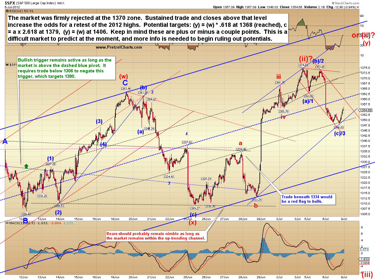
Finally, the short-term SPX chart.  Since the move was ambiguous and no key levels have yet been claimed by either side, the labeling reflects the ambiguity.


In conclusion, there is as yet no reason to believe that Friday's rally was the start of something long-term bullish.  That doesn't mean it wasn't, it just means there's no evidence yet.  The double-zigzag count we discussed last week was never invalidated and has remained on the table this entire time -- meaning that this rally, and even an extension of this rally, was/is still within the realm of probability... and it would not necessarily change anything in the big picture.  We'll have to see how the market responds to some key levels going forward to determine if the big picture outlook is shifting toward bullish, or if this was just a flash in the pan.  In the meantime: trade safe.

Reprinted by permission;  Copyright 2012, Minyanville Media Inc.