Amazon

Tuesday, September 4, 2012

SPX Update: A Month of Congestion


I, for one, am running out of patience for charting this market's short-term congestion, so I'm considering quitting futures trading and taking up a new career in a more exciting and action-packed field, like stamp collecting.  With the exception of the brief (and anticipated) head-fake to 1426, the S&P 500 (SPX) has traded in a 20 point range for four weeks now.  

Fed Doublespeak Friday created the expected volatility (and then some), but accomplished nothing productive in terms of price (or in terms of Bernanke's talking points, for that matter). 

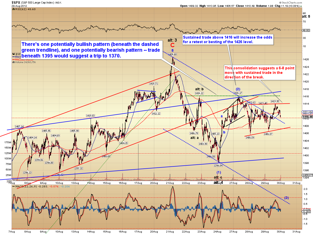
We're still in a no-man's-land price zone, and while my preferred outlook ultimately anticipates lower prices, the bears haven't yet claimed any levels to add confidence to that view.

Chart-wise, I'm going to start off with the very big picture view of the SPX.  The black channel was created by connecting the 2002 and 2009 lows and then placing a parallel copy of the trendline at the 2007 high.  The market has reached the zone where the fractal could be complete, and I still lean toward the view that it is complete -- but as yet there's no way to definitively rule out the possibility of a run toward the upper red trendline (in the mid-1400's). 

The big picture expectation is that the cyclical bull market is nearing an end.  As an aside, note the comparison of daily MACD readings in the bottom panel.


The next chart is an SPX monthly chart, and focusses on an interesting pattern in the monthly MACD readings.  Incidentally, the NYSE Composite (NYA) monthly MACD sell signal did persist into September, as I mentioned was likely in the last update.  This chart does argue that the bulls' days are numbered.


Next is a look at the Dow Transportation Average (TRAN), which is wrestling with support at the lower triangle boundary.  For comparison, the Dow Industrials (INDU) is shown in the lower panel.


The SPX 30-minute chart remained essentially unchanged for the entire month of August.  As boring as the market was, it followed the projected outlook very well.


My expectation is still that an intermediate trend change is underway, but the very short-term charts are open to a lot of different interpretations.  Sometimes I can look at a one-minute chart and call every little turn in advance for hours on end -- other days, I have no clue what the market is going to do next, and have to wait for it to "prove" itself.  The fact is, there's no system that allows us to know the market's every move in advance (and if there was, nobody would share it!). 

It's important to know when a system is vulnerable to noise, and this is one of those times. Elliott Wave just doesn't provide a clear direction for Tuesday from the current pattern, so the next chart is pure classic technical analysis; which might be more useful (and more realistic) than trying to label the market's every little squiggle at this stage. 

Based on the larger view, I believe this will resolve lower; but I'm uncertain if that will be immediate or will come after a retest of the high.


In conclusion, the market gave a host of top signals in conjunction with the expected turn at 1426; so I'm sticking to my guns for the time being on my preferred view that "the top is in."  To be fair, the decline thus far has been ambiguous, and hasn't added any confidence to that view -- but it hasn't done anything to detract from it either.  In my last update, I warned that the market was in a zone where it could bottom and reverse -- however, the rally on Friday was overlapping and looked corrective, which suggests that this isn't yet a meaningful bottom.  So far, it still looks more like a top.  Trade safe.     

Friday, August 31, 2012

Long Term Market Outlooks for Fed Doublespeak Friday


I'll get to the charts in a moment, but first, the news everyone will be talking about is whatever comes out of the Fed's doublespeak today at Jackson Hole. 

My prediction is that the Fed will (again) announce that they're not going to be launching QE3 right at this exact moment... but hey, their fingers are on the QE button and they have lots of Tools at The Ready, plus a really nice tool shed to store them in, and maybe -- just maybe! -- they'll be repainting that tool shed sometime soon with money printed out of thin air, which will stimulate the economy in a big way by adding at least one part-time job (the painter), plus it will consume paint, and then everything will be Just Fine, You'll See -- unless it isn't -- in which case The Fed is Always Willing to print more money via QE3 because, hey, their fingers are on the QE button...

Not that we've seen this movie before or anything. 

I am assuming they won't launch QE3 here, especially since they just extended Operation Friendly Game of Twister -- plus the market is near 4-year highs, which means my QE Flow Chart indicates that no new QE is coming right now.  This chart has worked exceptionally well for over a year, and has completely eliminated the need for difficult analysis that involves actual research. 

Before this chart was invented, CNBC pundits used to try to predict the likelihood of QE3 based on overly-complex factors such as:
  • Inflation
  • The economy
  • What color tie Ben Bernanke was wearing ("muted," "flamboyant," etc.)
  • The relative thickness of Ben's beard ("thick and loose," "tight and stingy")  
  • Whether Ben's beard matched his tie and the two messages agreed, etc.
But most analysts are now using only this chart to predict Fed response.  Here it is again, in case you missed it last time:


The odds are good tomorrow will be volatile, since that's pretty much the norm when the Fed double speaks and the market tries to follow along with Ben's statements of "QE3 is coming!  No it's not!  Yes it is!  Maybe!  Ha!"  Therefore, I want to start off with a big picture chart of the S&P 500 (SPX), since zooming-out often helps take the edge off volatile days.


The market has been awfully sloppy since June, so I've spent some time looking for similar fractals to see if they help decode the recent rally.  I found a fractal from 2008 which is extremely interesting due to the similarity not only in the shape of the waves, but in the actual price pivots.  I've annotated the corresponding pivot levels from the recent rally.


Next up is the 30-minute SPX chart.  No material change here since the expected peak at 1426.  The alternate count does remain viable and bears should stay alert now, because if that count is active, it should be finding a bottom soon.  The preferred count still believes it's more likely that the top is in, but there's been nothing in the way of confirmation yet.


Next is the short-term SPX chart, which will probably confuse the heck out of non-Elliotticians.  If you don't "get it," then just ignore it.

MORNING EDIT: With ES (E-mini S&P 500) futures up 9 points this morning, suddenly the 2nd alternate count looks a lot more reasonable than it did when I created the chart last night...


I also want to call attention to a couple other big picture charts: first up, the monthly NYSE Composite (NYA), which is a huge index that's pretty-well representative of the entire New York Stock Exchange.  A few months ago, NYA formed a monthly MACD crossover, which I called attention to when it occurred.  This long-term bearish signal hasn't been negated, and appears it will probably carry over into September.


The Russell 2000 (RUT) has failed to make a new high with SPX.  The chart really shows the sloppy corrective appearance of the recent rally -- the "weirder and whippier" comment of July 15 has proved accurate.


In conclusion, tomorrow could be a make-or-break day for one of the potential wave counts.  Bears should remain somewhat cautious at this point, because if the more bullish alternate count is going to play out, the market could begin a decent rally from here -- so I'm putting out the alert that if my preferred view is wrong, the market is now in the zone where it's finally likely to bounce.  One potential warning sign (not shown) was that VIX closed outside its upper Bollinger Band on Thursday, and this often leads to at least a short-term rally in equities.

If the preferred count is correct, however, then the 1426 high could still be subject to a retest, but will continue to hold for the foreseeable future, and the decline should start picking up steam once 1391 is broken.  The short-term will probably hinge on the strength of the Fed's doublespeak today.  Trade safe.

Reprinted by permission; copyright 2012 Minyanville Media, Inc.

Thursday, August 30, 2012

SPX Update: Zzzzzzzz... for SPX -- but Not for VIX


Thankfully, there's been no material change yet again (I say "thankfully," since I spent the majority of the day and night dealing with pressing personal issues).  Though the alternate count can't be ruled out yet, I'm still sticking with the preferred count, which continues to believe the top is in -- largely because of the sheer number of top signals that fired off heading into that turn.

Also interesting to note that VIX has been up strongly in recent days while SPX has flatlined.  This is often seen at market tops.


The updated 30-minute chart looks pretty much the same as yesterday's chart. In fact, I would have simply reprinted yesterday's chart (because I doubt anyone would have noticed), but I spilled ketchup on it.


I've updated the 5-minute chart as well, which has formed a small flag-like consolidation.  Price has done a lot of work all month in this 1400-1416 price zone, and that suggests there are a fair number of traders who've taken a stand here.  One group is destined to be on the wrong side of the trade in the near future.


In conclusion, there are no new conclusions from the last several updates, and almost anything I could type down here would only be courtesy of the Department of Redundancy Department.  Trade safe.


Wednesday, August 29, 2012

SPX Update: Market Sleepwalking Until Jackson Hole?


The last couple days of price action have made my job relatively easy (for once); nothing's really changed.  A week ago, after the adjusted 1425-1430 target was reached and the market promptly turned, I wrote: 

I feel reasonably confident that an intermediate trend change is now underway. Obviously, trade back above the 1426 pivot high would suggest the alternate count is in play -- however, even if that were to be the case, at the bare minimum, I expect this high will hold for several sessions and lead to a decent correction.
 
Well, it's done that much.  Now it appears the market is in a holding pattern, waiting to see if Bernanke emerges from Jackson Hole and sees his shadow, in which case we get six more months of QE.  Or maybe that's the groundhog... I can never keep the two straight.
 
(If you're a new reader, the overall intermediate outlook is probably summed up best in this article.)
 
Anyway, there very little to add in terms of comments to the following charts.  The first is a long-term S&P 500 (SPX) chart.  SPX is trying to hang on to its recent breakout.


The next is a 30-minute SPX chart, and it outlines the key levels for the bulls or bears to claim in order for the market to begin making more headway.


Finally, the 5-minute chart suggests the market is undecided and has set itself up for either outcome.  There's one short-term bullish and one short-term bearish pattern evident on this chart, so the price action is more likely to run whichever way it breaks.


In conclusion, the key short-term levels which provide clues remain unchanged from Monday and are outlined above -- and there's been no material change in the intermediate outlook for quite some time.  I expected the last lunge higher and the subsequent turn; now I'm just waiting to see if the market is going to add confidence to the preferred count, or if the alternate count will play out instead... and at the moment, it appears the market is waiting too.  Trade safe.
 
 Reprinted by permission; copyright 2012 Minyanville Media, Inc.

Monday, August 27, 2012

No material change


Yesterday, SPX was about as exciting as reading a washing machine instruction manual.  No material change in the outlook.  Trade safe. 

SPX and AmEx: Key Levels to Watch


On Friday, QE3 hopes ran high and the market failed to reclaim any of the bears' key levels.  Until the noted levels are reclaimed, higher prices still remain possible.  The first key level for bears to reclaim is 1391, and the first key level for bulls is 1416.  S&P 500 (SPX) chart below:


The 5-minute SPX chart notes some near-term support and resistance, and the potential of a head and shoulders pattern.  The tail end of Friday's rally could be a small ending diagonal, with one final wave up to around 1414 still to come -- but as noted, sustained trade above 1416 would increase the bulls' prospects for a retest of the 1426 print high.

The decline is thus far ambiguous.


The final chart is American Express (AXP), which is a stock I just added to my watch list.  AmEx appears to be in the late stages of a triangle consolidation, and should offer prospects for a decent trade upon clean breakout or breakdown from the triangle.


In conclusion, there's been no material change in the intermediate outlook: barring QE3, it's expected that an intermediate top is complete or in process.  Over the near term, the key levels outlined should help provide hints to the market's next move.  Trade safe.

Reprinted by permission; copyright 2012 Minyanville Media, Inc.

Friday, August 24, 2012

SPX, Gold, NYA: A Brief Overview of the Long-Term Outlook


Well, so far, so good on my call for a top in the SPX 1425-1430 range, and I hope readers were able to take advantage of that.  The market has lost a clean 26 points since then, and it looks like there's more downside still to come.

I'm going to get right into the charts, since I had a server crash yesterday, along with a number of pressing personal issues, and simply don't have time for a verbose article.  The chart annotations contain most of the relevant info.

The first chart I'd like to share is my long-term interpretation of the NYSE composite (NYA).  NYA is an excellent representation of the total market, as opposed to the Dow Jones Industrial Average (INDU) or the S&P 500 (SPX), which contain only the "best of the best" stocks.  NYA is more like the average person's "balanced" portfolio.

This chart helps provide some perspective on my current view of the big picture.


Next is the 30-minute SPX.  My standing bearish 40 point sell trigger has finally become active.  Trade back above the black trigger line would suspend the target, but trade above 1426 is required to completely negate it.  The next short-term target is 1386-1390.


A quick look at the very short-term SPX:


The Dow Industrials (INDU):


Finally, a quick update on gold, which is well on its way to reaching the target for the trade trigger I published a couple months ago, and which became active in July.  I would suggest watching the high 1600's and the rising blue trendline (which is currently crossing about 10 points shy of the trigger target) as possible resistance.


In conclusion, I probably couldn't have caught the recent top much better than the 5 point range I provided on Tuesday -- so why should I have any caution at all?  Well, sometimes the patterns work perfectly over the short-term, then mutate into something unforeseen on the next larger timeframe. For this reason, I have given a brief overview of the long-term, but I'm holding off from getting too focused on longer-term targets until there's more confirmation in the charts.

Just to play devil's advocate, I'll lay out what I believe would be the best-case scenario for bulls: over the short-term, it appears we're only about one-third to half-way through the current decline.  Over the intermediate term: if bulls are somehow able to reverse the decline and muscle back over the 1426 print high, then the next upside target for a long-term top would only be the mid-1400's -- so, barring QE3, I see no reason to be long-term bullish here. 

That's best case for the bulls, and that potential currently appears to be the underdog.  The market so far seems to be on track with my prior, and more-bearish, intermediate projections -- and there is currently no reason for me to doubt those.   Trade safe.

Reprinted by permission; copyright 2012 Minyanville Media, Inc.