Lately we've been hearing ad nauseum from politicians that there's a climate "crisis," so the first thing we need to clarify is this:
"change" ≠ "crisis"
These are two very different words, with very different meanings.
"Change" means "to make or become different."
"Crisis" means "a time of intense difficulty, trouble, or danger."
A few years back, all we heard was how there was a "consensus" on climate "change." But then politicians and the media gradually began to conflate the term "change" with the term "crisis," often by adding in their own commentary to "97% of scientists agree..."
They would say things like, "97% of scientists agree the Earth is warming up and that if we don't do something immediate and drastic, then we're all going to perish in flames! Everyone RUN FOR YOUR LIVES!"
97% of scientists agreed to no such thing; but this verbal bait-and-switch has been done by politicians and media to the point that few seem to question it anymore.
Thus, it is extremely important to clarify that there is no consensus on a climate "crisis." There is a consensus on climate "change" (though one can strongly debate the methodology of the surveys used to determine that "consensus," and further debate whether consensus has any value in science in the first place -- but for sake of argument, let's grant that point for now anyway, because it's irrelevant), but it bears repeating that there is no consensus that this climate "change" represents any sort of "existential crisis" for the planet.
The idea that there's a "crisis" is indeed held by a small minority of scientists, but the view is not shared by the mainstream. So climate "crisis" is a fringe position -- but because the general public listens to the media more than they read scientific literature, many have accepted this fringe claim without question.
So let's examine the claim. Because there's so much data to unpack, I've decided to break our examination of the evidence into several parts.
Where shall we start?
Let's start with something that bears being emphasized:
What I'm about to share is not controversial. This is mainstream science. Instead, the things you hear sensationalized on the news are frequently controversial, and often not mainstream science!
That's a major paradigm shift for most people, so I advise stopping and thinking about what that means for a moment. "News" is a business that exists to sell advertising. If the news doesn't have something that grabs your attention, you will not watch or read, and ratings/circulation will fall. "Hey, everything is fine," just doesn't grab your attention in the way that, for example, "WE'RE ALL GOING TO DIE TOMORROW!" might.
To start off, we'll begin with a common sensationalized claim that one hears frequently on the news:
Claim: "Thanks to CO2, the Arctic is warmer than ever before!"
First off, to know if that claim about the present has any veracity, we would need to know what happened in the past. Obviously, we can't know if the present is "warmer" (or colder) than the past unless we have past data to compare.
So we'll start by examining the recent past ("recent" in geologic terms, not in human lifetime terms; though we'll examine that, too). Earth is 4.5 billion years old, which means that if we calculate an average human lifespan of 80 years, then one "year" for Earth is equal to roughly 56 million human years. If the Earth existed on human time, then a human day would be more than 154,000 years in geologic time. Said another way: 10,000 years ago for Earth is the equivalent of about an hour and a half ago to a human (i.e.: tens of thousands of years represent the extremely recent past in geological time).
So, with a better grasp of geologic time frames: What does paleoclimatology tell us about the recent past? Is the Arctic actually warmer than ever before?
Well... the short answer is "no." As it turns out, the scientific data suggests that the Arctic is colder today that it was even a mere ~6,000-12,000 years ago.
Included below are screenshots of the relevant portions of many different scientific papers, with the sources shown in the screenshots, in case anyone wants to refer to the entirety of the papers. This is mainstream scientific literature that anyone can look up (including, I might add, our own vaunted news organizations -- if they cared to do any actual research before driving public opinion):
1. Arctic sea-surface temperatures were 3 C higher a mere ~8,000 years ago:
2. Arctic sea ice reached its minimum not recently, but in that same 6-12K BP time frame; this paper states that it is 2 to 4 C colder today:
3. This next paper was a study of Arctic bottom water temperatures, which, 8-10,000 years ago, were a massive 6 C warmer than modern temperatures:
4. The next paper agrees with the above time frames and suggests that Greenland ice was 500m thinner ~8,000 years ago than it is today:
5. Here's another paper on the Arctic's "ice free" past; again you'll note the time frames are all similar:
6. Another; this one focused on how Alaska was markedly warmer (2-3 C) around 9-8ka:
7. Sweden was also much warmer 8,000 years ago:
8. More on Sweden being colder today than it was in even the geologically-recent past:
9. In fact, Sweden was permafrost-free for much of recent history. The permafrost that we hear (from breathless voices) is melting is actually an anomaly to begin with; its existence is not the historic norm:
10. As we've seen, there's what you might call a "consensus" that the Arctic was warmer ~8,000 years ago. The next paper charts Greenland temps during that time. Do you see anything that looks like a "crisis" here?
11. On this next, note that the 0 time axis is on the left side of the chart, not the right side -- the right edge of the chart is 10,000 years ago. The Greenland ice sheet began increasing in volume ~5,000 years ago and is now larger than it was even as recently as the Roman Empire:
13. Let's cap this section with some very recent data: The Multi-Agency Sea Ice Extent chart for the Arctic from the past 15 years. This chart shows why, every single Summer, we hear panicked news personalities and disingenuous politicians talking about the totally normal oscillation of the melt/freeze cycle as if it's the end of the world... then we hear nothing from them all Winter, as the sea ice recovers and freezes yet again:
I could go on with another few dozen papers, but you get the idea. Again, this is mainstream science -- so why don't we hear much (or anything) about it from our vaunted media? Or from our politicians?
I'll let readers answer that question for themselves.
Now, if you want to see something really crazy, you don't have to go back 8,000 years. You can just research newspaper articles from the very recent past. I'm just going to put these up as self-explanatory -- note the dates on each one. As we'll see after this, the Arctic got colder again, though, which is why Greenland didn't "catastrophically collapse" in 1939, for example. (Interesting that the Arctic got notably colder while CO2 was rising; seems like relevant data if CO2 is indeed an important driver of temperature.)
1947:
1940:
1934: 100 degrees in Alaska. (And keep in mind that CO2 was pretty low in 1934.)
I have dozens more of these from this same time frame, but by now you're probably wondering: What happened? How come glaciers didn't "catastrophically collapse" 80+ years ago? Why haven't they collapsed by now, if the planet is heating to the point of a "crisis"? Why are we even still taking about this?
What happened was it again got colder. The planet got colder while CO2 was rising dramatically, in fact. From the 1940s until the 1970s, Earth's temperature dropped notably, but WWII, the Cold War, and the industrial revolution were in full swing during that time frame. Let's stay in the recent past for a moment.
In 1989, NOAA performed a detailed study of 92 years of N. American temperature data (1895 to 1987) and found (drumroll)... no warming trend:

How about more recently? Surely there must be a massive warming trend for the past 20-some years, right? After all, global CO2 emissions have been steadily rising, especially from China.
Well, you can go to NOAA's website and
check this yourself, but here's a screenshot of the U.S. annual temperature data as of 2/2/2021 (we'll cover the so-called "global" temperature data later):
I know my readers know how to spot the trend on a 22 year chart. Does the chart above look like a "warming trend" to anyone? Or does it instead look like oscillation?
Looks like oscillation to me.
Now, here's something interesting. What happens if we plot, say 1921 to 1993, a period during which fossil fuel consumption rose dramatically? (After all, few people even had cars in 1921 -- and the SUV wasn't invented until the 1930s). So if the hypothesis that fossil fuels increase atmospheric CO2, which in turn warms the planet, is correct (and
that is the hypothesis, by the way -- CO2 is not theorized to lead to cooling, but to
heating. The idea that we can blame both heat and cold on CO2 is nonsensical junk science and seems to be nothing more than a PR effort to make the claim
unfalsifiable (which means it is no longer "science")), then we'd expect that heat to show up in the data.
But instead, for 1921 to 1993 we end up with another flat, or maybe slightly down-trending, temperature series:
How about if we look at 1930 to 1970? This period was the height of the industrial revolution, with WWII falling inside that time frame and CO2 increasing notably. And interestingly, instead of the steady warming we might expect based on the hypothesis, we instead end up with a VERY CLEAR downtrend in temperature for those 40 years:
And this is exactly why we never saw those "catastrophic collapses" people were worried about in the 1940s, and why the 1970s were the height of the Global Cooling scare. For excellent context, I highly recommend watching this brief clip of Leonard Nimoy describing the terrifying descent into the next Ice Age (and an ice age is truly terrifying, I might add. Warmth brings life, but cold brings death -- for all living things, especially plants, which form the bottom of the entire food chain. If plants freeze or die, all life will die.)
In 1970, the New York Times reported on Arctic sea ice becoming "ominously thicker":
Time Magazine featured several memorable covers and articles that are the exact opposite of the covers and articles they feature today:
In fact, global cooling was the "scientific consensus" of the 1970s:
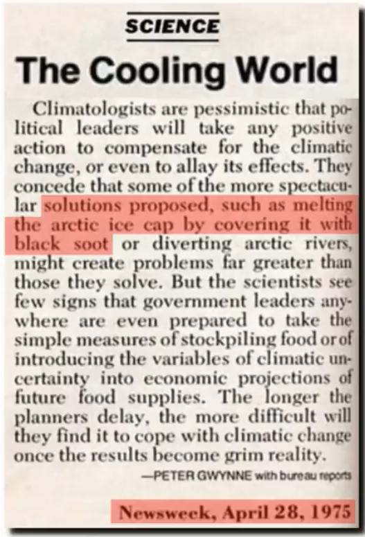
Did you know that scientists in the 1970s were proposing we cover Arctic ice with black soot, so that it would absorb sunlight and melt, to help warm the planet?
Now they're proposing the exact opposite -- because (most) scientists are people, and (most) people don't even know their own recent history well enough to see past their own arrogance and hubris.
So for several decades, CO2 was steadily rising, yet Arctic temperatures were steadily falling. We all know that "correlation is not causation," but what do you call it when there's not even a weak correlation between the hypothesis and the hard data? (that's a rhetorical question)
To sum it up, what does all this tell us?
Well, for one, it tells us that where we begin and end our temperature data series can give us very different apparent trends. Warming, cooling, flat -- all can be found over multiple decades, depending on the start and end dates we choose. So even if we grant the argument that it's been warming for 100 years (which, as we'll see later, is increasingly questionable data), would that even mean anything?
As far as the Earth alone is concerned, is there anything special about 1895? Or 1920? Or 1998? Aren't these all completely arbitrary starting points, in terms of Earth's climate?
The Earth is 4.5 billion years old -- what does a snapshot of a mere 100 years even tell us? I would say, "Not much," and the alternating modern "cooling" and "warming" scares seem to agree. (Imagine looking at a stock chart of only the past 30 seconds and then attempting to use that to make confident declarations about the long-term future trend. Would anyone be so foolish?) But we'll return to this point later, when we look at the long-term and very long-term paleoclimatology temperatures.
It also tells us that humans don't learn much from their own past mistakes.
So, to wrap up this little introduction:
- 6-12K years ago, the Arctic was considerably warmer than it is today (with CO2 at "background" levels), but we didn't have media and politicians around to tell us that was the end of the world.
- In the 1930s and 40s, the Arctic was melting (while CO2 was relatively low) and it was the end of the world.
- In the 1950s, 1960s, and 1970s, the Arctic was getting colder (while CO2 was rising) and it was the end of the world.
- In the early portion of the 2000s, the Arctic was melting and it was, again, the end of the world.
Maybe trying to judge long-term climate trends based on short-term human time frames is a fatal mistake.
And, to return to the original claim made by media and politicians: As we've seen from the data, the Arctic is most definitely not "warmer than ever before." Quite the opposite: The Arctic is colder than it's been in even Earth's recent past. Again, this is not "controversial" science. So why doesn't the general public already know this?
This concludes Part I.