Amazon

Wednesday, November 23, 2011

SPX Update: The Crash vs. Seasonality: Round One

The traditional wisdom is that light-volume holiday sessions, such as the sessions approaching on Wednesday and Friday, are bullish.

Since 1941, Black Friday (the day after Thanksgiving) has seen an average rise of 0.28%, and a positive close 70% of the time.  Yesterday, I also mentioned that the day before Thanksgiving has been a green session in 8 of the prior 9 years.

There's a reason for this, and it has nothing to do with good holiday cheer.  The simple fact is, the big hedge funds and commercials recognize that they can't dump huge quantities of inventory into a thinly-traded market, because the retail investors (i.e.- the suckers) aren't doing enough buying to support it.  It would tank the market in a big way if there were heavy selling on these light volume days, which would mean they'd have to settle for even lower prices on their inventory on Monday.  Their reasoning is to let it go up, then sell into strength when there's more volume.

In the past nine years, the only year in which Pre-Thanksgiving Wednesday closed lower was 2007; which was not long after the start of the previous bear market. Tomorrow, we might get a tiny clue about just how desperate the big players are.  If the market sees higher selling than usual during tomorrow's "traditionally green" session, it could lead to a large red candle on the charts.

But really, any close lower will be a confirmation of the market's underlying weakness.  Thanksgiving week is historically one of the best weeks of the entire year for the markets; if it's a bad week this year, then that's relevant information. 

Another fun fact: the Monday following Thanksgiving has been a negative day in 7 of the 9 past years.  So even during the bull runs, the big players have been in distribution mode immediately after the light holiday sessions. 

If my preferred count is correct, we are now at the very beginning of Minor (3) down.  In Elliott Theory, each impulse wave is made up of five smaller waves, so more specifically, we are in wave 1-down of Minor (3) down.  And if my big picture count is correct, then this market is different than anything most of us have traded before.  Under that count, we are in the midst of a third wave decline at Supercycle degree (alternately, we are in the midst of a Grand Supercycle third wave down, which would be even more powerful).

This bear market is, in fact, an ongoing continuation of the 2007-2009 bear market; the entire rally from the March '09 lows was merely a large counter-trend correction, the B-Wave of the ongoing bear.  2007-09 was the A wave (a first wave), and this is the C-wave (a third wave). 

The challenge of trading third waves can be that they often don't let traders in or out safely. Think of the recent run-up off the October lows: that was a C-wave, which is as counter-trend third wave. It stubbornly refused to pull back long enough to let the shorts out, or let new longs in. Eventually, everyone who missed the turn just had to buy into the teeth of it, which drove it relentlessly higher with no significant pull-backs.  (The Horn Tooting Department wants me to mention that my readers didn't miss the rally, and were even warned about it well in advance, as shown in this article from October 4.) 

Anyway, to give you an idea of the difference between the power of a first and third wave, look at the chart below.  The question I keep asking myself is: should iii of (1) (prior waterfall) be more powerful than 1 of (3) (current waterfall)?


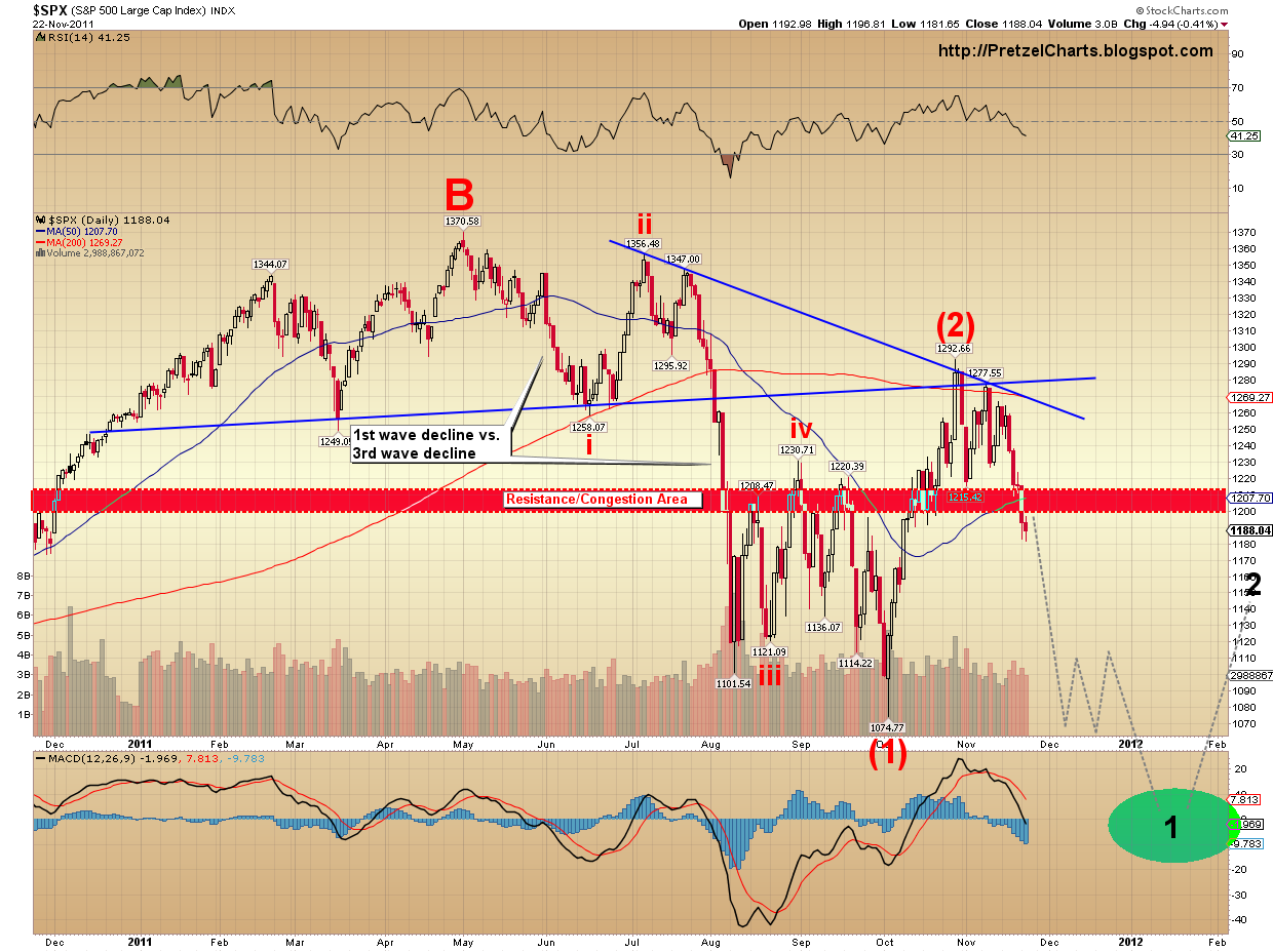
You'll also note the congestion zone of prior support.  Theoretically, this zone should now be overhead resistance.  Now, all that said, we are still not into the "meat" of Minor (3) down -- as you can see from the black "1" on the chart, we are only in the first sub-wave of Minor (3).

And all of this, of course, assumes my long term count is correct.  When this wave approaches bottom, I will again rigorously challenge my assumptions in that regard.  We lose the ability to navigate the market properly if we become too headstrong in our ideas of what "should" happen.

Thus far, the market continues to behave in accordance with my early November prediction of a waterfall decline.  I have continued to try to narrow down the very short-term possibilities, so far with a good level of success.  In a material sense, not much has really changed since yesterday.

Just to reiterate for new readers, my expecations are for this wave (wave 1-down of Minor (3) down) to carry the SPX into the 1000-1050 zone, although preliminary projections could stretch all the way down to the 800's.  I'll narrow that down when we get closer, but that's my preferred medium term view.

In the ongoing effort to try and uncover the path we might take to reach the medium term targets, the two very short term options I presented yesterday are still in effect today. 

The first (below) is the count I've been favoring over the short term since this leg of the decline began.  It's a bearish nest of 1's and 2's and indicates that the market has yet to see the strongest wave of the decline; it also suggests that significant rallies will be few and far between.  Under this count, the preliminary target for blue wave (iii) would be the 1150 area.

The blue (ii) can be knocked out if the SPX declines to 1175 or lower, then rallies back above the blue (ii) high.  If that happens, the count shown in the second chart becomes far more likely, and we may see a day or two of rally.


I am now favoring the count above at 58% odds, up a little from yesterday.  I would love to tell my readers exactly why I'm favoring this, but in order to do so, I would be forced to reveal my Proprietary Indicator of Potential Secrets (or PIPS for short --  I considered multiple letter combinations here, but then added in "Potential" to keep the acronym "family friendly").  Obviously, I can't reveal it, or else everyone would have one... and then I'd never be able to sell it to Goldman Sachs for so much money that I'll routinely be able to leave Cadillacs as tips.  But even PIPS isn't infallible, so a second short term possibility is outlined below.

The second possibility is the one being favored by most Elliott Wave analysts, since it's the safe and traditional way to look at things.  It's certainly possible for this to be playing out; and statistically, it would seem like one of these times I go out on a limb with my preferred view, I'm bound to be wrong.  This view has the market making a short-term bottom in the 1168-1175 area, then bouncing up toward the blue target box.  This would also fit the usual seasonality better, so maybe I'm an idiot to even suggest otherwise (and that thought has crossed my mind on a number of occasions). 

I'm giving this count 42% odds, so it's clearly possible, and there's certainly nothing definitive in the SPX chart to suggest it couldn't play out this way.


My preferred medium term view remains that Wave 1-down of Minor (3) down is now in process, however do remain aware of the bullish alternate count at this juncture.  We are now entering territory where that alternate count could conceivably form a bottom, if my preferred count is wrong.  I am keeping my odds at 15% for that count, as it simply doesn't fit well with everything I've been analyzing for the past month, but it's not impossible. 

The decline so far is three waves -- so from a technical standpoint, it could either be the preferred count as outlined, with the fourth and fifth wave still to come, or it could be an ABC correction for the bullish alternate.  Unfortunately, there's simply no way to know with complete certainty at this point.  This alternate would bottom soon and then rally up to new highs in the 1300's. 

As I said, I consider this bullish alternate to be highly unlikely -- but the market does have a mind of its own.  Trade safe.

The original article, and many more, can be found at http://PretzelCharts.blogspot.com

Tuesday, November 22, 2011

SPX Update: Will the Waterfall Crash Continue?

So far, the market has lived up to my prediction of a waterfall decline, and now everyone wants to know if it's going to continue.  Today we're going to take a look at a few things and try to answer that.

First of all, it helps to know what a waterfall looks like.  (By the way, I consider the terms "waterfall" and "crash" to be essentially synonymous, and use them interchangeably.)  The chart below compares the current waterfall with the prior waterfall decline, earlier this year:


We can see there were very similar top formations in both instances, and we can see that last time, there were bounces the whole way down.  And yes, I continue to favor a waterfall decline (or "crash" if you prefer) going forward. 

Note that the target for the top formation the market just completed, using classical technical analysis, is around 1150.  It would not be unreasonable to expect some sort of bounce from that level.

One of the things I like about the waterfall decline scenario is that the market action of "ratcheting" lower discourages shorts, and encourages longs.  The momentum never gets going down fast enough for the momentum traders to pile in, and it pauses just long enough to convince people the decline is ending.  This causes a max pain effect, which is what the market seems to enjoy doing to everyone.  Shorts either cover or don't enter, and longs keep buying and then getting creamed.

But make no mistake, under my preferred scenario, there will be lots of little bounces along the way.  The market never moves straight up or straight down.

Now that the market has provided another piece of the puzzle, I have been able to clean up the charts a bit.   Although my preferred count is bearish no matter how you slice it, of the various ways to count the current decline, I continue to favor the nested 1-2 count by a slim margin.  Call it 57.756% probability (I considered adding like 90 more digits to that -- be thankful I'm really tired!).  This count can be eliminated from contention if the SPX trades above the blue wave 2 high at 1223.51.

If this count is playing out, we could still see some rally today, but when it turns, the next leg down should show increasing momentum over yesterday's move; and the overnight futures sessions will likely create cash market gaps such as yesterday's.


The more conservative way to count the decline using Elliott Wave is presented below.  What I do like about this count is that it allows for the "seasonality" factor.  The Wednesday before Thanksgiving has been a positive market day in 8 of the 9 prior years.  Of course, none of those prior years featured the Congressional Stupor Committee, who, after months of heated negotiations, was finally able to tentatively agree on catering.  However, this is still subject to future review. 

Who knows what impact that may have on things; maybe that's why the nested 1-2 count has always looked more probable to me in the charts.  Anyway, the chart below is the "conservative" bearish count.  Under this count, it still looks like the market needs a lower low before we have a day or two of "happy rally time" before heading lower again.  The alternate black count considers the possibility that Happy Rally Time is already here.  Trade above 1211.36 rules out the preferred count; trade below yesterday's low rules out the alternate.


And of course, no discussion would be complete without mention of the short-term bullish alternate count.  If that count is playing out, change the blue and/or black "1" in the above chart to "C," and up we go, right on into the 1300's.  I continue to discount the probabilities of that count to about 15%.

In conclusion, my medium term target for the SPX is still 1000-1050; I'm just trying to pick nits over the short term.  Today looks like it could potentially see some continued rally early on (although that could be viewed as complete or nearly so), but I expect any rally will ultimately lead to lower prices.  Trade safe.

The original article, and many more, can be found at http://PretzelCharts.blogspot.com

Monday, November 21, 2011

Quick Silver Update (that's "quick silver" as in "fast metal," not the element mercury)

I did these silver charts over the weekend, but then got hung up trying to locate silver in its Primary count, as well as Cycle/Supercycle count.  The reason the larger degree of trend is important is because it could drastically change silver's outlook over the longer term.

Short term, I believe the target is the same under either count, so I figured I'd better post the charts for reference -- especially after glancing through my chartbook tonight and seeing the callout which says silver "may be ready to head down again almost immediately" -- which I wrote when I did the chart on Friday (?) night... and of course that's exactly what silver did on Monday.  Anyway, I'll come back to these and wrestle out the details regarding Primary degree waves and higher, but here's what I've got so far:


Keep in mind that silver's Primary degree count will impact this chart severely -- literally changing the bounce from one that reaches new highs, to one that reaches new lows.  So don't get too hung up on it until I figure out the larger trend degrees.  This all has larger impications that I think may be important to us, so it has become something of a project for me.  

Sunday, November 20, 2011

SPX, NDX, XLE Updates: SPX 1000 Here We Come (Right Back Where We Started From)

I believe this initial crash wave could move a lot faster than most are expecting.

Before going further, let me first state that I continue to be quite bearish both long-term and short-term.  The question I'm trying to answer now is whether this wave will start off a bit "slow" from here and bounce around for a few days, or whether the markets will breakdown extremely quickly.  I believe this leg will turn into a waterfall decline at some point; I'm just trying to determine whether that point is "now" or not.

I'm really just splitting hairs, because the preliminary medium-term target is 1000-1050 (SPX) under my preferred count (possibly as low as 800), no matter how we get there.

But the short term wave structure leaves a bit to interpretation, so I have prepared two short term counts: one is simply very bearish, the other suggests a waterfall almost immediately.  I'll let readers decide which makes more sense to them.  After studying more charts than you can shake a stick at (believe me, I tried, and the stick wasn't having it), I'm favoring the waterfall short term count by a slim 55% margin.  I should stress that it's far from clear-cut, and I've gone back and forth on this half a dozen times.  This is one of those cases when another puzzle piece or two from the market would be really helpful.

Again, note that the larger count remains the same for both charts, this is just an attempt to nit-pick the tiniest waves.

The first count I'd like to present is the conservative count.  This is probably the one being favored by most technicians, because it has the market doing what "typical" markets do; namely, retesting the breakdown point.  I have used the S&P 500 to illustrate this count:


There are a couple issues I have with the blue "conservative" count.  The first is that the two corrections called out in the chart annotation are both sharp corrections; Elliott guidelines dictate that the corrections between second and fourth waves should alternate: from flat to sharp, or vice versa.  The fact that they are both sharps argues that they are both second waves.  Several markets are also suggesting that Friday was yet another second wave.  We may not even have seen an internal third wave on this leg yet; and if that's the case, the decline will be brutal. 

Assuming my preferred count is correct, the second issue is that this is not a "typical" market.  This is a nested third wave decline, within a much larger third wave decline.  Expected bounces will probably go MIA (turning into nothing more than sideways grinds) and oversold indicators will become severely stretched to the downside.  As my friend Lee Adler likes to say, "There's no such thing as support in a bear market."

The second chart shows the more aggressive count, using the Energy Sector ETF (symbol: XLE).  This is the resolution I'm favoring, but the next couple sessions should shed some light on which resolution is unfolding.  It's also possible that this sector may decline faster than the SPX, under either short term count.


One thing going against the aggressive immediate decline is Thanksgiving week.  The seasonality this week is traditionally quite bullish.

The one thing I'm uncertain of, in both cases, is whether the current corrective wave, which started on Thursday, is complete yet or not.  I suspect it is, in which case we may see a gap-down open on Monday -- but I'm genuinely not sure.  Any further upside on Monday is probably a gift to anyone who takes advantage of it.  If we did get some form of rally, I would expect the 1236 +/- zone to contain it.

I'd also like to share another chart which supports the big picture preferred count.  This is a weekly chart of the SPX, and uses two indicators to confirm the market's bearish position.  The top panel shows stocks which are trading above their 200 dma; the bottom panel shows weekly MACD.  The chart explains the rest:


The chart above references QE1/QE2 "Party Time," and shows where the Fed's printing press artificially supported the market.  Since QE3 has been a hot topic lately, I want to share another chart, this one from my friend Lee Adler at the Wall Street Examiner.  One of the many helpful pieces of info that Lee tracks is Fed cash flow to the Primary Dealers (among many other things; this chart is from his 89 page report).  I want to share this to emphasize just how much liquidity the Fed had to pump into the system to support the two-year rally off the March '09 lows.  It's somewhat shocking when seen graphically, and serves to underscore how little "fundamental" support the rally actually had. 

Below are Lee's comments (and chart) regarding current conditions:

Fed cash to Primary Dealers remains flat. The slow growth, or no growth, of cash injections via the Primary Dealer route is as opposed to during QE1 and QE2 when the Fed was adding massive amounts of liquidity by purchasing large amounts of various securities, mostly Treasuries, from the PDs. The MBS purchases will begin to settle within the next couple of weeks. That should give the line a minor uptilt, which based on current conditions should not be enough to keep stocks in an uptrend without a lot of help from other inputs.


We can see on the chart, the Fed had to pump massive amounts of liquidity to the market just to keep stocks afloat below the 2007 lows.  Without QE3, it's hard to imagine where the fuel for continued rallies could come from.

I'm going to make another prediction right now: I predict that when this current wave down is close to bottoming (in the 1000-1050 range -- although it could extend down towards 800), the Fed will announce QE3.  Here's my reasoning behind that prediction:

1.  There's a decent bounce near the bottom of this wave "baked in" to the chart equation; QE3 could fuel it.

2.  Oil and commodities will be "crashing" right alongside the indices, so inflation fears will die down fairly soon.

3.  In 2010, when they announced QE2, the Fed demonstrated that they have a pain threshold relative to the stock market -- and they showed us right where that level is.  The Fed's pain threshold equates to the SPX 1000 mark, give or take fifty cents.

So that's my prediction for QE3.  Remember: you heard it here first.  ;)

The last chart I'd like to share shows the Nasdaq 100 (NDX).  The  NDX just completed a major top formation.  On Thursday, the support level of this top was broken, and on Friday, the NDX spent all day unable to rally back above it.  The chart also has some helpful hints on how to "get rich quick" in a bear market -- assuming you have enough capital to move the market, that is.


The final chart I should mention is the short term bullish alternate count.  If you aren't familiar with it, the chart can be found in Friday's article.  I'm keeping this count at 15% odds, although I've considered dropping it to 10%.  In any case, I'm not going to waste any space posting the chart; it's pretty much the same as it was on Friday. 

In conclusion, as I've said for weeks, I continue to believe that October 27 was a major top, and the markets are now in the early beginnings of a waterfall decline to new lows.  Personally, I generally make it a rule not to counter-trend trade during nested third waves, unless I see an amazing setup.  It's going to get ugly soon (for bulls, anyway); trade safe. 

The original article, and many more, can be found at http://PretzelCharts.blogspot.com

Friday, November 18, 2011

SPX and NDX Update: Crash Wave Finally on Deck

The crash wave I've been expecting for a week appears to have finally begun.  The markets showed some strong downside in the last two sessions, and did what they needed to in order to fulfill the expectations of the crash count.

The triangle, which I always believed was a "fake," but I showed anyway at 15% probability (since I can always be wrong), was finally eliminated from contention on Thursday.  I strongly disliked that count from the beginning, and didn't even bother to draw a chart of it yesterday.  Like a houseguest that overstayed its welcome, I'm quite happy to see it go.

The smallest leg down may be complete, and we could see a bit of a rally on Friday to wrap up OpEx week. Despite the fact that ES futures (SPX) are up, when I look at the charts, I have the continued "gut feeling" that there may be some surprises in store on the downside. Nevertheless, I have labeled the charts conservatively, and a snap-back rally today may be in the cards. 

I continue to maintain, as I have for weeks, that October 27 marked a significant long-term top in the markets.  If my preferred count is correct, the stock market will probably not see these levels again for a long time.  I believe that the next leg (after the obligatory bounces) will take the S&P 500 (SPX) down into the 1000-1050 range.  From there, I would expect one last marginal bounce before the market crashes for real (e.g.- 2008).  The intermediate picture is roughly sketched into the chart below:


The next chart is somewhat important as forensic evidence.  It's the Nasdaq 100 (NDX) and allowed me to tweak the labeling of the smallest waves on the SPX chart.  Over the past week, I was somewhat bothered by the idea of too many sub-dividing first and second waves on the SPX chart.  I had an alternate count labeled (in black) on yesterday's chart, and I now believe that labeling was correct, however the expecation of that count was too optimistic.  Let's take a look at the NDX chart to see why:

 
Under the alternate SPX count, I was expecting a five-wave move up for wave (c) of (ii) which never materialized.  When a wave fails to meet its minimum expectations, this is called a "failure" or "truncation" under Elliott terminology.  In the NDX chart above, you can see that the NDX did form five waves up, however, even there, the wave fell well short of the target.  You can almost see how the wave is being "bent" downwards, which caused its expected targets to fail.  It's almost as if the wave were being bent by a strong current; this was a precursor of high selling pressure, and these types of upside failures are something we will almost certainly see more of during this third wave down.

Below is the adjusted SPX count.  I have moved the wave (ii) label to line up with the NDX.  This makes quite a bit more sense now, and explains the challenges I faced in interpreting some of the more recent price action.  The corrected count now reveals that we are only just beginning red wave (iii) down.  Note that we are now able to move the knockout level down to the red wave (ii) high.


The final chart is the "bullish alternate" count.  This count would be short-term bearish, long-term bearish, and bullish in-between.  This count allows for the possibility that we are in the process of forming an ABC correction off the October 27 high.  Based on the different markets I've studied recently, I would be shocked if anything short of central bank intervention could make this count a reality -- but stranger things have happened. 

I am only assigning this count a probability of 15%.  In the near future, we will be able to determine some key levels to watch for validation of this count.  Currently there is not much we can do other than be aware of the possibility.


Assuming my preferred count is correct, market surprises going forward should be to the downside.  In third waves, momentum indicators reach oversold and stay there.  Bounces that should materialize, often don't.  The SPX still has key support in the 1190 area, and as I've said in every update for weeks, I expect that is still the level to watch.  Once that is broken, there's very little support in close proximity beneath it, and the move down should accelerate.  Trade safe.

The original article, and many more, can be found at http://PretzelCharts.blogspot.com 

Thursday, November 17, 2011

SPX and BKX Update: Next Move Should Be Lower

While virtually every technical analyst on the planet is watching the bullish triangle "continuation pattern" that's been forming in the indices all month, I have stated on several occasions that I don't think it's real.  After studying the price action of the last couple days, the triangle has not displayed the proper form, and the volume has not performed according to the pattern.  Volume should be diminishing as the pattern forms, but has been rising instead.  Doesn't mean it can't be a statistical outlier, but I am cutting my odds on the triangle from 20% to 15%. 

This is of course, the "all clear" for the triangle to break-out tomorrow and humiliate me (cue music from Jaws... visual: triangle rising from the dark waters and ripping analyst to shreds).  On the flip side, if I'm right, I should get a cookie for digging into the charts and breaking from the "easy answer" analysis.  Keep in mind that if this move down is somehow Wave e of that triangle, there may be a strong whipsaw below the lower triangle boundary and back up into it.  While I think it's low probability, be aware of it and respond accordingly if necessary.  Below 1215 would completely eliminate it from consideration.  For the triangle chart, please refer to yesterday's article.

Yesterday, the market performed exactly as the charts predicted.  So did the news, as I also opined that the Fed's sudden talk of stimulus was an attempt to front run a bad news event.  There's an age-old debate between fundamental analysts and technical analysts over which is more valuable, news or charts.  As a technical analyst, while I do believe that fundamentals are important and a driving factor behind the charts; I also believe that the charts are forward-looking, so with rare exceptions, news is noise. If you look at the charts I posted in my prior article, every one of them predicted yesterday's sell-off perfectly -- and I drew those charts long before the news (which allegedly sparked the sell-off) was released.  Funny how the charts knew ahead of time what was coming.

This is one of the reasons I often laugh when I see the headlines on CNBC, trying to explain why the market did what it did each day.  You see things like:

Market Sells Off on Renewed Fears Over Europe; which is followed the next day by:
Market Rises on Renewed Hope for Europe; which is then followed by:
Market Crashes as Investors Are Overcome by the Nagging Sensation That They Left The Stove On

It's all nonsense.  The market does what it does because humans follow patterns in their psychology and decisions; so the exact same news can be perceived as negative one day and positive the next.

I continue to believe that October 27 was an important top.  I have one count I've been favoring for some time now, but this count does allow two possible resolutions over the short term.  Those possibilities haven't changed since last Thursday, but I have consolidated both possibilities to one chart.  The burden remains on the blue count to prove itself.  It needs to begin making some marked progress in the downward direction.

The blue count shows the market forming a subdividing series of first and second wave (or nested waves, as I prefer to call them), which would lead to new lows fairly directly. The black count shows wave (ii) still in process.  Trade above 1260 would be the first clue that the black count might be unfolding.


The Philadelphia Bank Index (BKX) is another that's performed perfectly in line with expectations, so far anyway.  I posted a chart two days ago showing my projected path for the BKX, and would now like to update that chart with the recent action.  None of the projections have changed yet:


The fly in the ointment for the bear count is the specter of Fed intervention.  The credit markets are beginning to show extreme stress, and the Fed has talked up stimulus recently.  Fed intervention could blow this count up.  While news is noise, the Fed is liquidity -- and liquidity drives the markets.

Another potential issue for this bearish count is that the sideways market has been burning off bullish sentiment.  This is not something bears want to see.  The latest AAII sentiment survey came in at 41.9% bullish and 31% bearish.  That's a 6.5% jump in bears from the prior week -- which actually represents a 26% increase to the total number (from 24.5% to 31%).

Long-term, I remain very bearish.  I believe that, one way or another, Minor Wave (3) will carry stocks to new lows.  The biggest challenge in deciphering the short-term turns of late is that the market has been forming multiple zigzag patterns within a trading range.  Double and triple zigzags are among the hardest patterns to predict and project, since they have very few rules; and trading ranges give you nothing in the way of meaningful price points.  I assume these patterns are a reflection of the extreme uncertainty present in market participants. 

We would be fools to ignore market signals and new price data when trying to determine the market's short term path.  Despite whatever I "think" should happen at a given moment, I try to respond as objectively as I can to the charts as new information becomes available.

I am severely handicapping the triangle as a true possibility, but that doesn't eliminate it. The triangle is still within the realm of possibility, and might be the "Fed intervention" pattern.

My strong belief that we're headed lower in the near future hasn't changed.  The key levels to watch are still SPX 1215 and 1190.  Barring some type of central bank intervention, or the significant threat of such, a break of those levels should lead the SPX down into the low 1000's.  Trade safe.

The original article, and many more, can be found at http://PretzelCharts.blogspot.com 

Wednesday, November 16, 2011

SPX Update: The Picture is Again Becoming Clearer

For once, what I found most interesting about yesterday wasn't the charts. It was the push that suddenly materialized from the Fed to assure the market that the stimulus guns were ready, and loaded for bear.  I found that quite unusual, because the Fed meeting was barely two weeks ago, and they decided "no stimulus."  Are we to believe that the Fed governors suddenly woke up yesterday and randomly said to themselves, "Sheesh, well, THAT was a bad decision."  Hardly.

This concerted "feel good" effort seems to hint that the Fed is aware of some pretty bad news lurking on the immediate horizon; and they're trying to reassure the market before this news event hits.  I can't see any other logical explanation for the sudden about-face, and ensuing media blitz, in light of current events.  It's not like the market is cliff-diving at the moment; and it's not as if the economy got significantly worse in the lengthy span of two whole weeks.  No, I'm pretty sure they must be front-running some piece of bad news that has yet to reach the public; or perhaps it's something that's already there (such as the stress being shown by the credit markets), but hasn't sunk in for the public yet.  Either way, it's an unusual and telling move that indicates underlying issues may be worse than they seem.

In other news, I've just been handed a short note from the Horn Tooting Department, which mentions that yesterday's BKX count and chart has so far played out to a tee -- although I missed the exact bottom by 17 cents.  Hopefully, some readers were able to take advantage of that setup.

The charts are finally starting to narrow down some of the possibilities.  The "simple" explanation that most chartists are looking at is the potential triangle continuation pattern that's forming.  This would be bullish for equities, and implies a move higher.  That's certainly possible, but based on the best analysis I've been able to muster by examining numerous markets over the past few weeks, I find it less likely.  That could always change as the market gives new information in the future.

I still favor the bears here, as I have since October 27.  If the bears can get through the bulls first two lines of defense, SPX 1,215 and 1,190, they should be able to take the whole cake, and run this market quickly down to new lows.

Unfortunately, I can't tell you exactly what the market will do next.  I can, however, present a few things to watch for.  Since I continue to favor a bearish resolution, and continue to believe that October 27 was a meaningful top, there are two potential bearish resolutions I'd like to share here.  Both are counts we've been watching for a few days, but I want to share with you how they could diverge in the next few days.  The first chart shows the move as a series of sub-dividing waves, each forming a smaller first and second wave.  This count is just about out of time here, and needs to accelerate lower almost immediately, or it will lose plausibility.  The chart says "today," but today/tomorrow would still be passably acceptable.

The alternate bearish count is shown in black on this chart, but is detailed in the second chart.


The second chart shows another way for the bearish count to resolve.  The potential currently exists that the market is forming a double-zigzag formation, and I have drawn-in a likely way for that to play out.  I am starting to grow fond of this count, as it would cause the greatest confusion to all players with a head-fake triangle breakout.  This count also foresees downward movement from the market today, but instead of accelerating, it would then stage a rally near the lower triangle boundary:


I believe the market will seek one of those two resolutions in the coming days.  Both are quite bearish, and would both call for significantly lower prices once this correction is over.  I continue to favor a bearish resolution by an 80% margin.

However, if in the event I'm wrong, readers should be aware of the bullish possibility, should it start to unfold.  The bullish resolution is what many players here are expecting, as triangles are continuation patterns in the vast majority of cases.  I am handicapping this scenario at 20% odds; in other words, I think the triangle is a "fake."

Of minor note, this triangle is consummate with the expanding ending diagonal alternate count we've been watching for weeks; it's simply a different way to chart it.  Since the triangle has become so prominent in the charts, I feel it's more prudent to address the market in these terms going forward.


As I have stated repeatedly, I continue to be bearish at this juncture, whether that comes by way of the first chart or the second.  If the first count is to play out, it's do-or-die time, so today should answer the question of whether this ends immediately, or drags out for a few more days.  The bullish count is presented, not because I think it's likely, but because sometimes I'm wrong.  Trade safe.