Amazon

Friday, May 18, 2012

SPX Update: 81 Points of Profit Captured as the Market Reaches Critical Support


I'm very interested to see what happens today, as most are expecting a "Facebook bounce."  There is some indication that at least part of the decline was caused by investors selling other stocks in order to raise cash for the Facebook IPO.  These days, there is little new money coming into the market -- so the only way to raise cash for Facebook was to sell other holdings, which in turn contributed to the recent decline.  Theoretically, this cash should come back into the market with the Facebook IPO, and this would argue that Facebook’s IPO may, indeed, help drive some type of rally here.
 
Interesting how the Facebook IPO coincides with the fact that SPX has reached a potential bottoming zone according to the wave counts, and the market is oversold according to the indicators.   I’m intrigued to see how it plays out today.
Yesterday was another victory for bears, and the market is now in a price zone that crosses numerous long-term support levels.  It's also sufficiently oversold that it's advisable to watch for a potential bounce.  However, so far the decline has blown through support as if it wasn't there -- so this offers probability, but no guarantee. 

Moving onto the wave counts, there are two higher-probability interpretations.  I'm inclined to view this wave as the third wave of a larger third wave, but the charts do leave open the potential that the recent decline was an extended fifth.   Both scenarios are currently expecting some type of bounce, possibly as soon as today, though the idealized target for either is still a few bucks beneath the current market.  It's not always advisable to try and chase the last few bucks of a move, though.  As we'll see in a moment, we've already captured 81 SPX points, so there's certainly no need to get greedy here. 

Conversely, I would pay close attention to the trendchannels in the chart below before getting too excited about any bounces.  An "expected" bounce is not a "confirmed" bounce until the trendlines are broken, as noted on the chart.

This is where a trader has to decide whether they want to risk giving back some profit to chase a potential extended drop (by placing stops above the market), or whether they want to trade actively and take profits directly.  I myself am very tempted to use the first option, but my real-time read during the trading day might change that view.


I do want to call attention to the 60 point trade trigger discussed on May 2, as that trade has now captured the full profit of 60 SPX points (1305 target reached) since the trade elected at 1365.  Keep in mind that this trade came directly on the back of a successful 21-point trade trigger which elected at 1394. 

Thus those two trade triggers have captured a combined 81-points of the decline from 1394.  Not a bad two weeks!


To wrap things up, one of my favorite indicators, the McClellan Oscillator (NYMO) has finally reached the oversold zone where larger rallies often begin.  If you'll recall, this was the same indicator I called attention to on the exact day the market bottomed back in April.


As I've also pointed out on a number of occasions, this is also an area that should have longer-term price support. 

What happens next is absolutely critical to the bull case.  A bounce looks possible, and even likely here -- but the market makes no guarantees.  As I discussed yesterday, bulls absolutely must hold this zone.  An oversold market can be extremely dangerous if an expected major support zone fails. 

If support holds here, then a quick trip to the 1320's, or even the 1340's, appears likely.  So -- be on guard for a bounce here, but stay nimble.  If by any chance the 1290-1300 zone fails, I would give absolutely zero thought to holding long positions at this time.  Beneath that zone and the market could easily go into free fall.

To put it simply: the next session or two represent a critical test for the bulls.  I'm favoring the view that they'll manage some type of bounce here, but also favoring the view that this bounce will be short-lived.  Trade safe.

Reprinted by permission, copyright 2012 Minyanville Media, Inc.

Thursday, May 17, 2012

SPX, RUT, and VIX Updates: Market Placed on Crash Watch


A person is placed on suicide watch when he or she displays certain self-destructive patterns and behaviors.  Likewise, a market is placed on crash watch when it displays certain destructive patterns and behaviors.  As I've been warning about for the past couple weeks, this market has displayed certain "red flag" behaviors, and the pattern is now becoming quite dangerous if not reversed quickly. 

I should add that I use the term "crash" in the sense of "a strong, unrelenting decline that really messes up your portfolio."  Some people envision 1929 when they hear the word -- and while that's always possible, the charts below tell the story of my current expectations.

All hope is not lost yet for the bulls, as they have one major line of defense remaining, which we'll discuss in a moment -- but first, an explanation of why the market is being placed on crash watch.

In Elliott Wave Theory, one of the things we pay attention to is called the "base channel."  The majority of corrective moves remain (approximately) within this base channel, so when the market stays within the base channel, we can then expect the prior trend is more likely to resume.  However, when the market falls out of the base channel, it is strongly suggestive that the move is no longer a correction, but a new trend.

There's also a name for the channel which is expected to follow the base channel -- it's called the "acceleration channel."  Pretty self-explanatory.

The chart below shows the base channel in purple.  Yesterday, I thought the bulls might make a run at recovering that channel, but we can see in this chart that they were unable to do so. 

Unless the market finds support quickly and recovers the channel, the move has strong potential to accelerate lower.   


So, while the market remains outside this channel, it is officially on crash watch.  Long positions should be considered high risk as long as the market remains beneath the lower channel boundary, which now crosses roughly 1345.

As I talked about yesterday, the market has yet to see anything even approaching the level of strong selling that we'd expect to see at a meaningful low -- which means this strong-selling phase is most likely in the market's future.

Another indicator which agrees with the danger discussed above is the Volatility Index (VIX).  VIX effectively measures the amount of fear present in the market, so when VIX goes up, it means the market is going down.  A couple weeks ago, I talked about the fact that VIX had built a solid-looking base from which to launch a rally.  It has now broken out of that base and, so far, successfully back-tested that base.


The Russell 2000 (RUT) has also lost key support.  It is in a similar postion to SPX: unless it can rally back above the red trendline, it's in real danger.


The short-term picture has been extremely difficult to sort through, as the market has formed a number of somewhat unusual and unpredictable fractals filled with excessive overlap.  At this stage, a small bounce would fit nicely into the picture, but certainly isn't required.  The short-term pattern that's now formed is either:

1)  An ending pattern (ending diagonal) which will find a near-term bottom quickly (not necessarily an intermediate bottom)
2)  The prelude to a strong decline.

Unfortunately, the two patterns look almost identical at this phase in their development.  Paying attention to how the market behaves near the upper trendlines should help provide clues.  The blue "(2)?" annotation illustrates what could happen if this is an ending pattern.

The alternate count (in black) considers the potential of a decent bottom forming in the near future, possibly in the low 1300's (as discussed in a moment), which would allow the market to recover the base channel and thus be taken off crash watch. I currently consider this count to be the underdog.


Now let's discuss the bull defenses.  The last major line of defense for the bulls comes in near the 1290-1310 zone.  The two charts below illustrate this.

First is the S&P 500 monthly chart, which shows a series of support zones crossing just beneath the current price levels.


Next is an hourly chart, with a more detailed look at shorter-term support (and resistance).  This chart also echoes the importance of the 1290-1310 zone.  Bears should be alert to a bounce from this zone.


In conclusion, what happens in the next few sessions could be critical to the market's longer-term health.  Since May 4, I've been stating that the market is in a dangerous position -- but in the last couple sessions, the market's position has grown exponentially more troublesome.  If bulls want to have any hope of staving off a much deeper decline, they are going to need to stage a strong defense soon, and recover some key levels.  My expectation remains that the intermediate trend has indeed changed to down, but, as always, the market is the final authority.  Trade safe.

Reprinted by permission, copyright 2012 Minyanville Media, Inc.

Wednesday, May 16, 2012

This Decline Isn't a Selling Panic, It's a Buying Strike


A few signals are finally starting to reach oversold levels, but there's nothing to mark the extreme levels normally associated with more meaningful bottoms. 

As I was looking at the charts earlier, particularly the down volume to up volume ratio (chart below), it struck me that the market hasn't seen any terribly strong selling yet.  This seems to be more of a buying strike than a selling panic.  Usually, we would expect to see some type of capitulation to mark a low that will last more than a few sessions, but we've so far seen nothing of the sort.  As I stated yesterday:

What's interesting about this market is that it's managed to grind lower without reaching any extreme levels in bearish sentiment, or extreme oversold readings in certain key indicators such as the McClellan Oscillator (NYMO). As long as this situation persists, it is completely plausible for the decline to continue essentially unabated.


Below is the chart of the NYSE down volume to up volume ratio.  Note how most meaningful lows are coincident with significant selling.  So far, this decline hasn't even reached the selling levels of the April 2012 low.  This of course doesn't preclude short-term bounces, but it's hard to see an intermediate-term bottom forming yet.

This tells us that the real selling hasn't even hit this market; it appears the bulls are holding "long and strong" for the time being.  I've said it before: markets don't need tons of sellers to drop -- all they need is a lack of buyers.


Perhaps ironically, this is when the market is the most dangerous.  Few realize that crashes usually start when the market is already oversold, not when it's overbought.  The numbers are telling us that the real sellers haven't stepped in yet -- so it appears the decline is currently being driven primarily by short-term traders and algo-bots. 

This is a market ripe for an "event."  If things continue to muddle along and the real sellers don't ever step in, then the market will most likely continue to move in a reasonably orderly manner.  But if this market gets spooked by something while in this position, it could easily spark a panic wave.   

As I've said for the past couple weeks, the market is still in dangerous waters. 

Moving on to the projections, my intermediate term outlook has remained unchanged for the past couple weeks, and I've continued (and still continue) to expect lower prices for the bigger picture.


The question now is exactly how we'll get there.  Up until a couple days ago, the short-term targets were being hit perfectly... then the charts got a bit messy, and have stayed that way.  The chart below shows two potential short-term wave counts; one is immediately bearish, the other is short-term bullish.  Both roads are assumed to lead to the same intermediate term outcome, as shown above.

I'm favoring the count shown in blue and red by a very slim margin.  I have labeled the black count as the alternate, but there's really nothing in the charts to give me a reason to strongly favor one result over the other. 

I should also mention that there is a third option not shown on the chart below, and that's for a repeat of the fractal shown between black alt: ii and red (2) (called an "expanded flat").  I'm sorry the short-term charts are so messy right now.  Blame the market -- I don't make the charts, I just read 'em.  Things should become clear again soon.


In conclusion, it will be interesting to see if the bulls can get anything going here, or if the buying strike will continue.  As of this moment, there are some reasons to suspect a short-term bounce may be in the cards, but as yet still nothing to indicate a substantial bottom.  Trade safe.

Reprinted by permission; Copyright 2012 Minyanville Media, Inc.

Monday, May 14, 2012

SPX Update: As the Market Grinds Lower, Complacency Abounds


Yesterday, both counts expected more downside, which the market provided.  The picture has clarified just a little bit, and, as I see it, there are two main options for the short-term resolution.

What's interesting about this market is that it's managed to grind lower without reaching any extreme levels in bearish sentiment, or extreme oversold readings in certain key indicators such as the McClellan Oscillator (NYMO).  As long as this situation persists, it is completely plausible for the decline to continue essentially unabated.

It seems everyone is looking for a bounce, and I must admit I'm starting to look for one as well.  But when everyone's expecting a bounce... well, you know how I feel about the situation where everyone's looking for something.  Generally speaking, the more people who are expecting a certain outcome from the market, the less likely that outcome becomes.

This occurs for the simple reason that people position their trades in anticipation of what they believe is coming -- so if everyone's looking for a strong decline, then most traders have either already sold, or are positioned short -- which in turn means there's no one left to sell to drive the market lower. The same applies in reverse for rallies. The majority of traders simply need to be on the wrong side of the trade for a strong move to occur in either direction.  Keep that in mind next time you're on the wrong side of the trade:  so was most everyone else. 

Accordingly, I've prepared only two charts today, in an effort to keep things a bit simpler than yesterday's article.  I searched through approximately 20 charts, looking for a Holy Grail to unlock the market's intentions, but came up with nothing.  Virtually all the charts seem to be showing the same level of veiled intentions.

The first count I'd like to share examines the possibility of an a-b-c expanded flat to complete wave ii.  The market left this option on the table at Monday's close by failing to form a complete 5-wave decline.  The decline is currently 3-waves, and it may or may not stay that way.  Obviously, I can only see what's actually present in the charts each day.  If the decline goes on to form another new low, that will give it a 5-wave structure (see 2nd chart).

I'm favoring this resolution, primarily because I feel that red wave ii needs to consume more time before completion.


The second chart examines a much more immediately bearish view.  This remains viable because, as discussed, there is absolutely nothing screaming for a bottom here.  Usually we would expect some extremes in either sentiment or reliable oversold indicators before seeing a trade-able bottom.

The chart below also quietly notes the possiblity of wave (5) sneaking in near the 1330-1335 zone (shown in black, "alt: (5)").  In this regard, I'd suggest watching the lower blue trend line/channel.  If the market blows through that line, then there's probably more selling ahead, since the inability of bulls to hold that level would indicate renewed selling pressure.

Even under this more bearish count, I suspect another small wave up, but make no guarantees regarding the wave c of 2 bounce.  The one minute chart is indecipherable to me in that regard and the wave labeled as blue-a could instead mark ALL OF blue 2, in which case the 1347 print high will contain any rallies. 


I continue to believe this market is in a much more dangerous position than is commonly being acknowledged.  I suppose that's how it needs to be -- once again, if everyone's on the lookout for something, it rarely happens. 

In conclusion, there are some key levels to watch for clues on Tuesday, and potential targets for each count.  Note that both counts continue to believe the intermediate trend is now down.  Trade safe.

Reprinted by permission; copyright 2012 Minyanville Media, Inc.

Market Liquidity Report -- Special Guest Post by Lee Adler

The following is an extended excerpt from my friend Lee Adler's Wall Street Examiner Professional Edition.  Since we all know that liquidity is key to the market, I thought this report might be of interest, especially since his conclusion jives with what I'm seeing in the charts tonight for a possible larger snap-back rally. -- Pretzel


Market’s Liquidity Indicators Begin To Tilt Bearish


The composite liquidity indicator downticked last week on small declines in most of its components. We know that the downtick in the Fed’s pumping to Primary Dealers is temporary, but the weakening in other indicators may not be. Over the course of this latest surge, most of the cash has been targeted at the Treasury market, with stocks getting only an occasional bid. As Treasury supply goes through its seasonal increase, the pace of the advance in Treasuries should materially slow. If the indicator stalls, then both stocks and bonds could be weak. As long as the indicator remains in an uptrend however, Treasuries should continue to rally, and stocks should at least get an intermittent bid.

The following is an extended excerpt from the Primary Dealers section of the report.


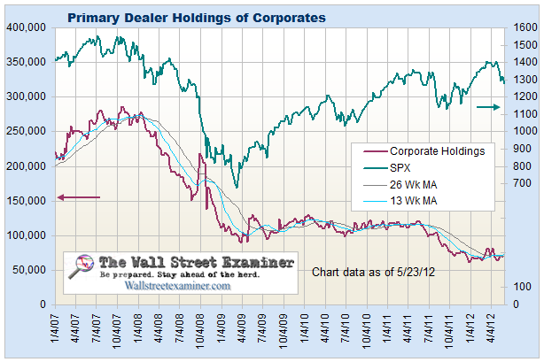
Primary dealers’ fixed income holdings dropped sharply in the week ended 5/2/12 (reported with a one week lag), after a big increase the week before. When they start reducing those positions that should signal a more persistent rise in yields. They continue to reduce their positions in corporates, a downtrend that has been under way since October 2007 (chart, page 52).


Primary Dealer Holdings- Click to enlarge


Primary Dealer Holdings of Corporate Bonds - Click to view


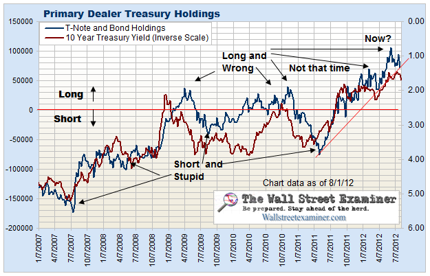
Primary Dealers sold some of their big Treasury long position in the week ended May 2, (reported with a one week lag). Based on the long term chart of the 10 year yield (next page), Treasuries remain at an extreme level of extension from the trend. This looks like a distribution pattern, similar to the one in early 2003.


Primary Dealer Holdings- Click to enlarge


The dealers are still getting a lot of help from European capital flight and heavy public buying so as long as they maintain their positions at this level, yields should stay low and bond prices high. When this pattern breaks (chart below) is when yields are likely to start trending higher.

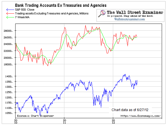
Commercial bank (including foreign based US branches) trading accounts grew by $1.0 billion in the week ended May 2 (after revisions). The short term and intermediate trends of this indicator are now neutral. This indicator is included in the liquidity composite.


Bank Trading Accounts - Click to enlarge


The Fed settled no MBS purchases in the week ended May 9. At the same time, purchases and sales under Operation Twist were slightly offset resulting in a small net sale that was not material and will be quickly reversed. The dealers no longer have the benefit of the huge Treasury paydown windfall that they had in mid April. They will suffer the opposite, with increasing levels of new Treasury supply to absorb. That will mute the bullish effects of the Fed purchases of MBS.

There should be a large settlement this week. It may already have occurred or be under way and it is probably part of the reason Treasuries have been so strong for the past couple of days. It is no accident that the Fed schedules these big settlements coincident with the settlements of the 10 year and 30 year bond auctions. This could give stocks a little boost later this week.

If you're interested in subscribing to Lee's service, please click here.

Sunday, May 13, 2012

SPX and INDU Updates: It's Painfully Obvious What's Going to Happen Next... or is it?


The very short-term charts are still a mess.  Some personalities feel that an analyst should be able to have a strong opinion on the market at all times -- unfortunately, out here in the real world, that's simply not realistic or possible.  Sometimes I have a strong opinion, other times the market dictates a "wait and see" approach. 

Personalities who require a high degree of certainty and security are probably not cut out for trading, since the market is an oft-ambiguous place.  If you ask your broker, they will most likely tell you that they "don't try to time the market" so even the majority of brokers are afraid of trying to sort through the potentials.  It's not an easy gig.

Accordingly, I'm going to discuss what I feel reasonably confident in, and what currently appears ambiguous. 

Here's what I'm (almost) certain of:

1.  The market will make a new low beneath 1343.

However, there are two issues that I'm simply not certain of:

1.  Will the market make a new short-term high first (above 1365)?  (I view this as less likely, but not impossible.)

2.  Is the corrective rally from 1343 a fourth wave at low degree -- or actually the second wave at higher degree?  It appears to be a fourth wave, but that's not as clear-cut as some would like to make it.  Very muted second waves at this degree have been known to occur in extremely weak markets;  examine the 2011 mini-crash (below) for a recent case-study.


Before the open on Friday, I discussed the strong potential for a gap open on Monday, and the short-term counts seem to indicate this opening gap will indeed come to pass. 
The present challenge at this juncture, which I've alluded to in the past, is that fourth waves will often string together several complete fractals to make up a larger fractal. The rally from 1347 to 1365 was a complete a-b-c fractal, which is what led me to believe at the beginning of last week that there would be new lows coming beneath the 1347 print low. This happened, of course, and yet because of this tendency of fourth waves, I cannot be absolutely certain that the 1343 low was not still part of the fourth wave.
Further, I simply can't be certain whether the recent bounce was red wave ii or a continuation of blue (4).  It would be very weak for a second wave -- but again, see 2011 for examples of why that's not impossible.  On the Dow Jones Industrials, it counts passably-well as blue (4) (see 2nd chart). 

At times like this, we'll simply have to play it by ear as it unfolds.  Despite the aggressiveness of the count below, and the fact that it's not "obviously the right count," I am leaning ever so slightly toward this interpretation.  When everyone's on one side of the counts and market, I say: bet the other way.


The Dow counts well enough as a running triangle, but the e-wave looks too impulsive.  The same potential ugly wave ii exists here as well.  On this chart I've labeled the aforementioned fourth wave as the preferred count, for contrast.


The incredibly bearish potential which seems to have been ignored by most is the possibility that this whole decline has been nothing but a nest of 1's and 2's.  I've illustrated this on the RUT below.  There has been absolutely nothing to allow this count to be ruled out -- and if this is what's occuring, then the market could decline relentlessly if support fails, so be careful out there.


Since the potential wave counts are ambiguous at the moment, I've prepared a simple chart of support and resistance.  Sometimes these can be useful until the count clarifies.  The potential support at 1340 does lead one to believe that the wave (5) count could be the correct interpretation.  It bothers me that this count is almost too obvious, however.  When a support zone is that obvious, many traders front-run -- so when the market finally gets there, there may not nearly as much support as everyone thought there would be, since many buyers jumped in early. 

Through the years, I've seen the market set traps like this before. 

If we get a solid bounce near 1330-1340, great -- wave (5) it was, and enough buyers were waiting in the wings to drive a decent rally.  But if we get a muted bounce there, then watch out.  Because if and when the "obvious" support zones break, everybody tends to bail at once and the market tanks. 


Below is a zoomed-in version of the support/resistance chart shown above.


In conclusion, both counts are ultimately expecting new lows below 1343.

The "obvious" count is that the next low will mark wave (5) and lead to a solid bounce.  I'm not 100% sold on that view, however, and I think the market is potentially in a very dangerous position.  If support holds, then great: false alarm.  If it doesn't, things could get ugly fast.

There has been some talk of late regarding Germany possibly capitulating to a new round of printing from the ECB.  If that happens, then all bets are probably off for the bearish intermediate term view (the short-term outlook still stands), since that new liquidity flood would find its way into the market, just as the last one did.  As such, I should also mention that it still remains viable from an Elliott Wave perspective that the decline from 1422 will be fully retraced after the next bottom and that an intermediate-term low is nearby... but until the market can either reclaim some key levels and/or form a more convincing bottom (or the EU announces LTRO II), I'm not giving much air-time to that potential. 

I'm sorry that my certainty -- beyond expecting new lows -- is limited at the moment, but to pretend otherwise would be intellectually dishonest.  We're simply going to have to watch how it develops over the next few sessions to gain further clarity.  Trade safe.

Reprinted by permission, copyright 2012 Minyanville Media, Inc.

Friday, May 11, 2012

SPX Update: Things Aren't as Bad as You Think! They're Worse.

Before I get into the charts, indulge me a bit of a rant regarding some of the systemic fundamental problems facing the world. 

By now, everyone (with the possible exception of those guys who live under rocks in the Geico commercials) understands that Europe is in trouble.  However, not everyone understands why Europe's troubles should impact American stock markets.  I'm going to try to explain why in very simple terms, because the problems facing the world now are so deeply-interconnected that the technicalities quickly become overwhelming to the average person.

It's a little-known fact that European banks have been bailed out previously by the American taxpayer.  European banks received $30 billion in bailout money, using AIG as a conduit.  A "stealth bailout of Europe," if you will.  This fact alone would outrage most Americans, but for some reason, it's not talked about very often. 

And it gets worse. 

After the Federal Reserve opened lending to foreign banks, the Belgian-French bank Dexia alone received $59 billion.  So American taxpayers (and America) are on the hook to Europe.  If Europe falls apart, it will be the shot heard 'round the world, because banks like Dexia in turn owe Goldman Sachs and JP Morgan (and others) substantial debt; so if Europe can't pay its debts, then our banks will also suffer.  Thus, in a similar way, the European Central Bank's Long Term Refinancing Operations (LTRO) were a stealth bailout of American banks.

I've discussed this before, but many investors mistakenly believe that stocks are driven by fundamentals, such as the economy, the employment rate, etc..  While it's true that the economy can have an impact on the stock market, it's not for the reasons most people think.  The only thing that drives stock prices is liquidity.  If there is excess liquidity, some of that cash finds its way into stocks and other assets -- so one frequent by-product of a good economy is a liquid market, which means stocks rise.  However, the economy itself is, in reality, only impacting the market indirectly.  The reverse is usually true in a bad economy:  bad economies lead to a liquidity crunch and stocks fall.  But not this time.  In a moment, we'll discuss why.

To understand the concept of liquidity vs. the economy as a driver of stocks, simply look at the Nasdaq Composite, which is currently trading above its 2007 high.  Then ask yourself:  is the economy as good or better now than it was in 2007?  Obviously not -- so if the economy were truly the driver, then the markets would be substantially lower, since things are worse than in 2007.  So why aren't the markets lower?

Since 2009, the massive money printing from the TARP bailout, the ECB's LTRO, QE1, QE2, Operation Twist, and others, have provided the liquidity to keep the stock rally going. As far as I can see, this liquidity is virtually the only thing driving stocks higher.  The amount of liquidity injected into the system in recent years is mind boggling, yet stocks have barely reached 2007 levels.

Anyway, that liquidity gets confused with "real" money, and also gets spent as real money -- which drives stocks and other assets higher. ("Real" money is money created when an economy produces more than it consumes.  In other words: real money comes from production.)  In this current world, there is limited production:  the prime mover driving asset prices is inflation from the printing presses. 

But this game is not without consequence.

To illustrate a portion of the problems facing the world's banks and governments, I'm going to draw a simple (and probably illegal, if put into practice) analogy.  Please note that I'm not recommending you try this at home -- leave this stuff to the trained professionals at the Fed and ECB.

Let's imagine that you had three checking accounts, all of which had a real balance of $0.  Now let's further imagine that you write a check for $1000 to yourself from account #1 to account #2, while simultaneously you write another $1000 check from account #2 to account #3, and another $1000 check from account #3 back to account #1. 

So it looks like this:

Account #1 = $1000 ---->  Account #2 = $1000 ----> Account #3 = $1000 ---> Account #1

For a brief instant on your balance sheet, it will appear as if you have $3000 -- even though, in reality, once all the checks clear against each other, you actually still have a real balance of $0. 

This is not unlike what many of the world's governments and banks have done for themselves and for each other.  The reason it works better for them is that their "checks" take years, or even decades (with long bonds, for example) before they have to be cashed.  If you could introduce the same long delays into your hypothetical (and illegal) checking account activity, then you could pretend you had $3000 for a while.  And if the checks counted as credits immediately, but weren't actually debited to the parent accounts for years, then you could even spend the money in each account, just as if you really had $3000.

I realize this is a dramatic over-simplification -- what's really happening, especially when you factor in credit default swaps and everything else, is nearly as complicated as the quantum mechanical concept of paired particles and their ability to communicate across infinite distances at speeds faster than light.  Maybe 8 people on the planet truly understand the complete math behind either concept, and unfortunately, it seems that none of those people are actually in charge.  Which introduces another problem: the massive complexity of the system lends itself to human error.  We all know that the more moving parts something has, the easier it is to break... and the harder it is to fix once it's broken.

Despite my simplification for purposes of illustration, this checking account analogy is not entirely unlike what's happening out there in the real world, except out there it's occurring on a massive scale.  The banks and governments of the world have been spending as if the "checks" they wrote to themselves (and each other) were real money for so long, that at this point, virtually everybody owes everyone else a piece of the Pretend Money Pie.  Eventually, somewhere down the line, one or more accounts are going to need to be debited for the cash. 

And then it all falls apart, because there is no cash. 

This basic issue is the reason why, from a fundamental perspective, I remain bearish. 

Does that mean stocks will collapse this week, this month, or this year?  Possibly; possibly not.  The charts are certainly warning that the potential is there, right here and now.  But these are uncharted waters in a way.  We've never seen this level of massive and coordinated intervention in the "free" markets at any prior point in history.  This makes things a bit challenging for an analyst, because we really have nothing to go on except the lessons and patterns of history.  But this is an experiment that has no precedent.

Certain signals that often foreshadowed declines in the past have, in this new world of endless bailouts and the tireless printing press, sometimes simply foreshadowed more intervention -- leading the market to rally against the seeming odds. 

So the situation doesn't preclude stocks from moving higher over the intermediate term.  But it does lead one to wonder how long this massive Ponzi scheme can continue.  Further, there does seem to be a diminishing return to the money printing, if one compares how each successive money launch has yielded smaller and smaller rallies in stocks and bonds.  At some point, one of the links in this massive chain seems almost certain to fail.  And when one link breaks, the whole chain falls apart.

What are the charts telling us?

The charts are telling us that things may be about to get a whole lot worse.  The possibility of a big decline is definitely present right here and now.  As I discussed yesterday, this is a case of potential energy.  The market has wound itself up, and a solid break beneath the key S&P 500 level of 1340 could cause a rapid drop.  I hesitate to use the "c" word ("crash" -- get your mind out of the gutter!), but the potential does exist.

Will it come to pass?  I don't have a crystal ball, but from what I can see, the probability is reasonably high.

Let's start with an overview of several indices.  This chart shows that virtually all indices have broken, and most have back-tested, their key uptrends off the October 2011 lows.


Below is my "first-stage" chart of the probable decline.  I expect that, if this plays out, it will be only the beginning of a much larger decline.  I currently view this as the most likely outcome over the intermediate term.  Sustained trade and closes north of 1385-1390 would cause me to seriously re-examine this outlook.


Next up is the very short-term chart.  Unfortunately, my confidence in the very short-term patterns is low at the moment.  Red wave ii may have topped already, short of my target zone, since there does appear to be a complete a-b-c fractal in the 1-minute chart.  This could mark ALL OF wave ii, or it could string together a couple more fractals before completing.  I've outlined some signals to watch.


A short-term potential that definitely occurs to me is a weekend trap for either bulls or bears. Unfortunately, since the very short-term pattern is unclear as of the time of this writing, I'm uncertain on whom the trap will be sprung.  The two short-term counts both have the potential of a gap open on Monday.  We can see that if wave b plays out into Friday, the trap could be sprung on bears, with a gap up in a c-wave.  If wave ii completed, the trap could be sprung on the bulls, with a gap down in wave iii.  It's a treacherous market right now.  Hopefully, Friday's action will convey some signals in this regard and answer the question ahead of time.


And finally, the bearish potential present in the very big picture.  It's far too early to confirm if this will unfold at this juncture.  The potential is definitely there, however.  Bear in mind that this chart represents a general guideline of how things could unfold -- it's not intended to be an exact prediction, but more of a broad overview.


In conclusion, the bulls have been unable to get much done, and the market presently looks quite weak.  My expectation is that the market is beginning the next wave down (intermediate term), and still in the early phases of a major trend change.  The market is the ultimate authority, however, and what happens over the next couple weeks, and possibly as soon as the next few sessions, appears to be crucial to the bulls maintaining any hopes of a continued long-term rally.  Trade safe.

Reprinted by permission, Copyright 2012 Minyanville Media, Inc.