Early last week, the structure of the waves suddenly looked quite bullish -- however the market has, so far, failed to follow through, which is causing me to re-examine this outlook.
Normally, one can determine the next higher degree of trend by determining which structures are impulsive, and which structures are corrective. The challenge right now is that the last 3 waves, both up and down, all appear reasonably impulsive. This could be indicitive of an undecided market.
I can't tell you how many hours I've spent charting during this weekend, but it seems like four or five hundred. Even though the market yutzed around a bit on Friday, it still seems to me that unless the bears can push through and take out the prior swing lows, the bulls have an excellent shot at sling-shotting the market to new highs. Let's examine the evidence together.
Short-term Outlook
The conventional impulse count would view this as a nest of 1's and 2's, which means that it's just about time for the bulls to run with the ball here, early this week. If they don't, then it will be prudent to give more serious consideration to other potentials.
I want to start off with the short term Dow chart, because it shows the relevent conundrum of how the last three waves all appear basically impulsive. Despite that, in just looking at the very short-term charts of Dow and SPX, I'm inclined to continue to give the edge to the bulls. One of the reasons is mentioned on the chart.
There are some bigger picture factors which we'll discuss in more detail further along.
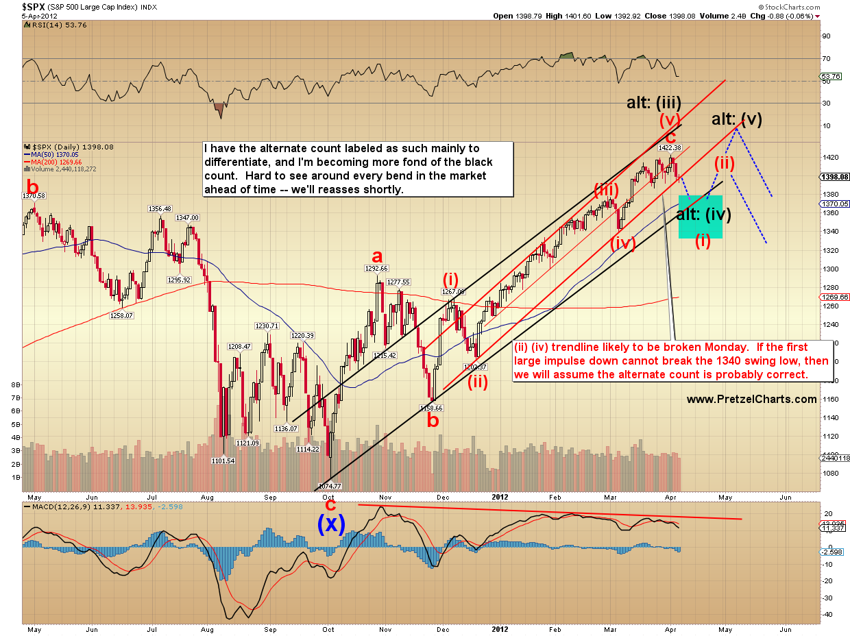
Next, the SPX preferred count.
The hypothetical ending diagonal is next. We'll continue to watch this as a potential.
Based on the big picture discussed further along in the article, I continue to believe this is an excellent and viable option.
I also wanted to provide an update on Chevron (CVX). It is unclear whether Chevron has completed 5 waves down in a fifth wave failure, or whether this bounce is still part of a flat 4th wave correction. I'm leaning toward the 4th wave correction interpretation.
Next, an update on silver, now that I'm able to project some more exact potential short-term targets.
A quick big picture glance at silver below. Silver bulls will note the potential of a much larger inverted head and shoulders pattern, going back to October.
Next the RUT, which is in a similar position to everything else. This still appears to be the wind-up for a move higher. If this is a nest of 1's and 2's, then the next wave higher should show some solid momentum. If the move doesn't show this, then we'll give more consideration to the alternates.
Short term NYA chart below -- pretty much the same deal there. This chart isn't labeled with the ending diagonal count, but that count is currently my first alternate. I consider the more bearish alternate count show below (in black) as less likely.
When to Get Bearish
Most of the above charts are labeled with invalidation levels, but below are a few more things to watch. If the bears
did break these key levels, then things could get ugly fast.
Below is a short-term SPX chart which shows the more immediately bearish potentials. I'm not favoring the ultra-bearish view, due to the "extra" leg up shown early last week -- which in my mind, continues to ultimately point the way higher one way or another. As mentioned, though, if bears can take out some of those key lows, then that would open the way to this type of resolution.
This chart also shows an interesting potential for the ending diagonal count -- in green. I do tend to believe that if the diagonal is playing out, it will probably follow a path closer to that discussed on the diagonal chart shown earlier, but the option below is still viable.
If the diagonal's playing out, then they are super-difficult to predict early in the pattern.
The big picture overview continues to show that the bulls are maintaining the recent key breakout levels. Right click and "open in new window" for the full-size chart. Until those breakouts are negated, it seems unwise to get overly bearish.
It generally pays for bears to remember the three-t's: Tops Take Time (TTT). Not always, of course -- but usually. Take a look at 2000, 2007, and 2011 on the chart below for examples.
The Very Big Picture
Short term, I remain moderately bullish, for reasons discussed above. The big picture, however, suggests that equities bulls have their work cut out for them.
(The possible exception to this thought is the dollar, discussed further below.)
Several markets are approaching, or have reached, very long-term resistance levels. We'll start with SPX.
Nasdaq also faces resistance, in the form of the 50% retrace off the all-time-high. Worth noting, the Nasdaq 100 (NDX -- not shown) has now had
13 straight higher closes at the weekly level. The record is 14.
RUT has also reached long-term resistance, and a potential triple-top zone.
NYA also faces what should be a solid long-term resistance level.
The next NYA and INDU charts (below) don't really fit into the "very big picture" section, but I'm not sure where else to put 'em, so they go here.
Below is an interesting INDU pattern comparison. If history repeats, it suggests higher prices over the short-term. Some key levels are marked.
The US Dollar is currently in a position that's actually somewhat encouraging to equities bulls. It remains beneath long-term support/resistance.
Based on my wave analysis, I continue to believe the dollar put in a long-term bottom with the 2008 print low -- but this chart bears watching.
Unless equities bulls can take out these levels, which seems unlikely this late in the rally, then it seems that upside is probably limited here.
Okay, deep breath... do I still have more charts? Lemme check...
Ah yes, saving the best for last.
Speculative
The first chart is interesting, because it shows that Apple has potentially completed a five-wave rally. It's a bit tricky, due to the lack of clarity regarding the correct labeling for the last correction (wave 4).
But the potential definitely exists for Apple's top to be in, or very close. This would, of course, mean the rest of the market would struggle, as also suggested by the big picture charts above.
I've recently started referring to Apple as
The Economy, since it single-handedly accounted for more than half of the 4th quarter profit growth of the
entire S&P 500 (as outlined in
this article by Matt Nesto).
And finally, my piece de resistance (French -- literally: "really cool chart") for this article.
As I was studying the Nasdaq and the US Dollar this weekend, I couldn't help but notice some striking similarities present within the two monthly charts. Below is an overlay of the current Nasdaq (going back to the crash) with the dollar after its (government-orchestrated) crash in the 80's.
After its crash, the dollar spent some time basing, and then retraced right to the 50% level in a convincing rally. From there, it spent some time topping and then resumed its march to new lows. The Nasdaq has behaved similarly regarding the basing action, and has also now reached its 50% retrace (as shown earlier).
I haven't seen this analog discussed anywhere else yet, probably because the two markets just recently "lined up" historically and nobody else has noticed -- but I think it's pretty uncanny. Of course, the $64,000 question is: going forward, will the Nasdaq follow the same path the dollar did after it hit its 50% retrace?
Conclusion
Over the short-term, I still believe there are likely some marginal new highs to be made, but the pattern leaves a bit to interpretation, and the market does feel like it's topping at some degree. The next few sessions should help illuminate the short-term path with more clarity.
The bevy of long-term resistance levels suggest upside is probably limited at best, and I think the longer-term outlook for this market is ultimately bearish. If bulls can somehow break out convincingly here, then that would certainly call that view into question.
Something that fits into both outlooks is a trip into the 1430's-1440's -- so as of yet, this is still what I'm currently favoring. Obviously, the flip side of things is that if the bears can stage a convincing breakdown of some key levels, then all bullish bets would be off. One thing that can be stated with certainty is that the rally is well above the relevant MA's and very long in the tooth; and sentiment has been extreme for a long time now.
For these reasons, I remain somewhat partial to the ending diagonal, which was proposed last week as a hypothetical. This would allow a choppy upwards grind to slowly frustrate and wipe out everyone -- and would be quite fitting as a larger topping pattern. Trade safe.