Amazon

Thursday, January 19, 2012

SPX Update: Rally Reaches Important Resistance Zone

Wednesday's market action pushed up into the 1300-1310 resistance zone I've been talking about for a couple weeks, and this is the bears last real line of defense in the short term.  We've looked at so many indicators over the past couple week that seem to be signaling a top (sentiment, divergences, numerous indicators, unfilled gaps beneath the market, wave counts, etc.), that it's hard to believe the bulls will push through here.  But ultimately, the price action rules.  If the bears can't stop it here, the S&P 500 (SPX) is clear for a run to 1325 -- and potentially to 1350. 

Logic dictates that I have to continue to favor the bears at this juncture, due to all the circumstantial evidence. But indicators and historical studies don't always play out as expected.  The bulls have an intact uptrend; while it seems the bears have just about everything else.

For the bulls to show that they're serious, the market needs to break above, and hold, 1310.  A head-fake breakout briefly above 1310 wouldn't do much technical damage to the bear case; but sustained trade above that level might.  You'll see what I mean when we look at the longer-term charts.  In any case, we have to be prepared for the possibility.

Fundamentals seem to favor the bears as well, especially if you believe that governments need to take in more money than they're spending in order to be considered solvent.  But as Keynes said, "The market can remain irrational a lot longer than you can remain solvent."

Given the current fundamentals, my twist on that old saying would be: "The market can remain insolvent a lot longer than you can remain rational."    

Certainly, despite particular fundamentals, there may be bullish influences acting behind the scenes that we simply can't see.  The cash fleeing Europe into the U.S., which we discussed yesterday, is clearly one contributing factor.  The European Central Bank's operations are certainly another -- and Lord only knows what Uncle Ben's up to half the time.

The charts are now pointing to a big move -- which direction it heads is going to depend on whether 1310 is captured by the bulls or not.  There's one potential count which could put finally the bulls to rest -- but it's one of those patterns that, if it doesn't play out for the bears, could morph into another melt-up rally.

Before we get to the short term charts, let's take a look at some longer-term indicators and patterns, and some of the reasons I remain inclined to favor the bears over the intermediate term.  The first chart shows a very interesting divergence between the broad-based NYSE Composite index and the SPX.  In 2009, the NYA supported the SPX's rally -- in fact, it often led.  This showed that investors weren't just buying a few select stocks, but were buying the broader market -- "A rising tide lifts all boats," as they say.  Currently the NYA is lagging the SPX considerably, and has yet to break above its October highs.  The last time the two indices diverged like this was August 2008.


The next chart is a daily SPX chart and shows some secondary indicators.  These indicators behave in certain ways during bear markets, and in different ways during bull markets.  There are two things of note on the chart: 

1)  The relative strength index (RSI) is still in "bear-market bounce" territory. 
2)  Standard deviation was still showing bear market volatility levels as recently as last month.


The next two charts are the short term wave counts.  Whoever wins the battle around 1310 will probably determine which of these is unfolding.  The preferred count (below) suggests the top could form today or Monday.

 
The alternate count suggests the market could run into the 1325-1350 zone.  The concern I have with this alternate count is that the move it suggests could potentially flip many long-term indicators into a bullish position.  If this second count unfolds, we'll have to watch the indicators carefully - but we'll worry about that if and when we come to it.


In conclusion, the 1310 zone remains important.  Again, based on the preponderance of evidence, logic dictates that I favor the bears over the intermediate term -- but logic doesn't always work when it comes to the market.  Trade safe.

The original article, and many more, can be found at http://PretzelCharts.blogspot.com

Wednesday, January 18, 2012

SPX Update: How Much Longer Can Europe Support the U.S. Markets?

There is an unusual pattern that's developed over the past couple weeks, where the market gaps higher in the morning, then gets sold for the rest of the day.  This is often a reversal pattern, but it has so far not yielded a meaningful reversal.  This made me curious if this had happened before in quite this way, so I spent a good chunk of the night looking through daily charts covering the past 2,700 trading days on the S&P 500 ETF (SPY) to see if I could find a similar pattern to the current rally.  Amazingly, I couldn't.  Perhaps the closest analog would be April/May of 2008, but that's not exactly right either. 

This looks like distribution to me: ramp the heavily-leveraged futures at night for a fraction of the cost of the cash market, then sell your inventory when the market opens.  In this vein, there are two interesting fundamental factors at work right now:

1)  There have been huge inflows of cash into the U.S. from foreign investors who are fleeing the European system, and some of that money is finding its way into stocks.  This is bullish as long as it continues, and it seems to be primarily what has driven the current rally.
2)  There are large outflows from domestic mutual funds.  This is bearish as long as it continues.

I have an interesting speculation that perhaps the U.S. fund managers are ramping the futures each night and, effectively, distributing to the Europeans.  Who knows.  But it's a strange pattern nonetheless.  One would think that, at some point, most of the money that's going to flee Europe will have done so already and the well will start to run dry.  When that will happen is far beyond my ability to anticipate: it may have happened already (data in this regard lags the market), or it may be at some future date.

My friend Lee Adler at the Wall Street Examiner does a great job tracking market liquidity, and most of my data in this regard is garnered from his Professional Report subscription service.  Here are two charts from his service, which illustrate the situation. 

The first (on right) shows deposits into U.S. trading accounts -- based on supporting data, these are presumably coming from Europe.  As Lee states in his report:  "This remains a bullish influence for U.S. markets; a.k.a.- the last Ponzi game."  The data is from the week ending January 4, so it lags by a couple weeks.

The second chart (right) shows domestic mutual fund outflows.  The most recent data here is also from the week ending 1/4/11.  Weekly outflows have reached the highest levels since August.  Lee states, "This continues a bearish signal on the charts... a continuation of heavy outflows could eventually take a toll on stock prices."

So as of the week of January 4, the market was in a bit of a battle of liquidity inflows and outflows.  Whichever source wins that battle heading forward is going to determine future market direction.  I believe the European inflows simply can't last forever; and that seems to be the only thing keeping the U.S. markets afloat right now. As I stated earlier, since this data lags, a victor to this battle may have emerged already.  This is why I generally use stock price charts first, and data second -- because the price charts are real-time, and should theoretically contain everything the market "knows." 

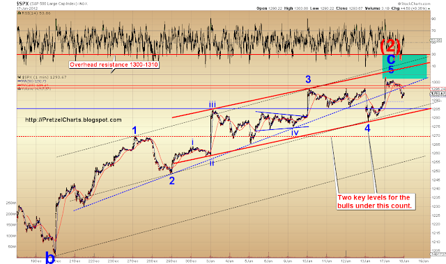
The short-term wave pattern could now be viewed as complete, meaning the top may be in -- however there has been nothing to confirm any sort of trend change yet.  What I would really like to see is a full daily candle beneath the lower trendline to confirm a top, but the market is still a ways from that.

The first chart I'd like to share is good old classical technical analysis; after that we'll look at the wave structures.  The chart below highlights three factors which suggest a turn may be at hand, all noted on the chart.


So there is continued evidence for a top, as there has been for roughly a week... but the market is still hovering.  Some might take that as a bullish sign.  Personally, unless the SPX breaks through 1300-1310 and holds it, I'm not going to get overly excited.  But I've been wrong before; and the money flowing in from Europe is certainly an x-factor that bears watching at this stage.

The next chart is the second chart from yesterday, which shows a potentially-complete five wave structure to a top.  If this count is correct, the top is now in.  It's also possible that wave five of 5 is still unfolding, with yesterday's low being four of 5.

 
The next chart is an alternate short-term count.  This count has a few things going for it, such as it effectively explains the bizarre structure of the recent rally (which looks like a series of a-b-c's).  I'm keeping this count as the alternate for the time being, but market action could shift this count into the preferred role.

NOTE: CHART ANNOTATION ERROR -- THERE IS NO INVALIDATION FOR THIS COUNT.  That's what I get for doing too many things at once some nights.  :)


In conclusion, unless the market breaks the key levels of 1300-1310 on the upside, and holds that break, I continue to believe that a top is close at hand, and that the market has given no real signals to become long-term bullish.  At the same time, it's not yet given any concrete price signals to be short-term bearish either.  There continues to be a great deal of evidence for the bear case, as outlined today and over the last week or two, but the bears need to start taking back some key levels to validate that evidence.  The first level for bears to capture would be 1285 -- and then 1277 and 1270 below that.  If the first count is correct, then perhaps this is the week the bears finally get 'er done.  I believe the influx of European cash which has been supporting this market is (clearly) a finite source, and likely to be tracing out some type of bell curve.  When that liquidity clears the apex and hits the slope, the market is going to run out of juice.  Trade safe.

The original article, and many more, can be found at http://PretzelCharts.blogspot.com

Monday, January 16, 2012

SPX and US Dollar Updates: Dollar Ready for Second Stage Lift-Off

Friday started off very promising for the bears, with a break below the significant support zone of 1285; however the bulls were able to get the market back above this zone before the close.  As I wrote on Friday, everything that happens between 1285 and 1300/1310 is just noise at this point -- so we're still in a bit of limbo regarding short-term direction. 

The market has been sitting in the target reversal zone for what seems like forever, and I'm starting to feel like a broken record everyday with "either the top is in, or there's one more thrust higher still to come."  Well, you'll be happy to hear that... nothing has changed yet.  If I didn't have to actually update the charts (and didn't feel obligated to provide my readers with new info), I could just do a form-letter for the updates until the market actually reverses.  That would save me a lot of time.  Trade safe!

Of course I'm only kidding.  Sort of.  Anyway, for today's new info, we're going to talk about the historical tendencies of this week.

The market started closing for Martin Luther King, Jr. Day in 1998.  Going back to 1998, this has historically been a pretty bad week for the markets, with the S&P 500 (SPX) ending the week negative 71% of the time for an average loss of 1.10%.  The worst loss was 2010, when the SPX shed nearly 4.5% for the week.  Couple that with the fact that January options expiration also tends to be negative -- the Dow Jones Industrials have suffered heavy losses on OpEx Friday in 10 of the prior 13 years -- and you have the makings of a week that favors the bears.

It is also likely that the bulls are running out of time on Minor Wave (2), if, of course, they haven't already.  Friday may have finally marked the turn, but there's still enough play in this ugly, ugly wave that there may be another thrust higher left in it yet.  It pays to remember that the absolute hardest thing to do when predicting the market is to call a turn before it happens, be that turn a bottom or a top.  When you predict a turn, you are betting against the trend.  And as they say, the trend is your friend... at least until the end, when it bends.

The first chart we're going to look at is the intermediate chart of the SPX, which shows the long-ago-reached Wave (2) target box, which the market seems intent on sitting in until the cows come home to roost (or whatever that saying is).  The expectation remains that once this wave reverses, the October lows will be broken. 

 
The next chart is the short-term SPX chart, with one possible count that suggests the market may have suffered a failed fifth wave on Thursday, in which case the top is in.  I'm favoring this count, but only by a slight margin.  Any significant downside follow-through on Tuesday would likely seal the deal; conversely, any upside beyond the recent swing highs would invalidate it.  If this count is invalidated, consult the second chart below.


We'll follow that chart immediately with my alternate count, which suggests wave 5 didn't fail, but actually started on Friday.  The short term wave structure of this rally is maybe the ugliest I've seen in about 6 months, and has really kept me guessing.  Remember the two week decline in December when every target zone I published was hit like clockwork?  That was an ugly waveform too, but nothing like this rally.  This current rally is the Ernest Borgnine of waveforms.

Also note how the market bounced right where a perfect new trendchannel could form (in red).  This is a very common occurrence, and it's one that veteran traders know to watch for.  I strongly suggest drawing channel lines whenever two swing highs or lows allow it during the day, to help anticipate potential reversal levels. 

The target for wave 5 would still be the 1300-1310 zone under this count, though that could change with new input from the market.  I still think it's unlikely the market will hold above that zone for more than a brief moment, if at all.


The last chart is the updated US dollar chart.  The correlation between the dollar and equities has uncoupled lately, but will almost certainly recouple at some point in the future.  In any case, the dollar is the one market that hasn't let my predictions down even slightly since my first published dollar update on September 3, when I predicted that a major bull market was starting in the dollar. 

I'm updating this chart because the dollar corrected right into target zone suggested on January 9 and reversed higher -- and the waveform out of the reversal zone looks impulsive, meaning it seems very likely that the nested third wave-up is about to break higher in an explosive way.  Since it seems to have completed five-waves up, a short-term correction is likely to occur first.  After that, it strikes me as probable that even though equities have been ignoring the dollar, a big move like this may get some attention -- from the algo-bots, if nothing else.  Note the blue melt-up channel.


In conclusion, I continue to believe that a top in equities is at hand; and that the dollar is going to continue markedly higher.  It's worth mentioning that I've had an excellent record at calling tops and bottoms, and hit both the October turns, and December turn, pretty darn well -- however, the market hasn't yet fulfilled my prediction that it will break the October lows.  So I haven't been too terribly early when calling tops (nailed the October bottom, but major bottoms are easier), but I have been too early in projecting where those prior tops would ultimately end up. 

Sometimes it's hard to see ten steps down the road, and traders may want to remember that although Elliott Wave allows us to make these predictions, often with a high degree of accuracy, there are always multiple paths the market can take to reach conclusion.  The lesson I hope to convey with this is that traders who protect their profits can do very well just hitting the turns, even if the market doesn't go down that road as far as one hopes it will every single time.  Trade safe. 

The original article, and many more, can be found at http://PretzelCharts.blogspot.com

Friday, January 13, 2012

SPX Update: 12-year Study of Investor Sentiment Points to a Top

The latest American Association of Individual Investors (AAII) sentiment survey numbers were released yesterday, and amazingly, were virtually unchanged from the week prior.  For the second week in a row, bearish investors remain at 17%, still near decade-long lows.  This struck me as a rare situation, so I decided to investigate further.

I set out to uncover how the market reacted when there were two or more consecutive weeks of bearish investor percentages this low, using bears below 19% as the control figure (thus allowing for roughly 12% standard deviation in the data figures). After combing through 562 weeks of AAII data by hand, I discovered that since the 2000 market peak, there have only been twelve other occurrences of this scenario.  Interestingly, the current back-to-back reading of less than 19% bearish is the first occurrence we've seen in almost six years.  So indeed, this is a rare set up.

After locking down the dates of prior occurrences, I went on to chart each example on the S&P 500 (SPX), in order to visually coordinate how the market responded to the excessively low bearish numbers.  What I found was that two or more consecutive weeks were always associated with some kind of peak in the market, even during bull markets.  In bull markets, the peak was sometimes minor, but it was still a peak.

There is another very interesting finding in my study.  Without exception, when bearish investors disappeared during bear markets, it was due to a technical breakout on the indices.  In other words, the shift in sentiment was due to market technicals, and not due to an improvement in the fundamental backdrop.  Conversely, this was not the case in bull markets, where the sentiment shifts didn't seem to correlate to any particular technical levels.  This has important connotations regarding the market's position now.

It seems we may be facing a similar situation today, as the market staged a technical breakout in December, yet the fundamental backdrop seems to have improved very little.

As I present the charts, the question investors need to answer for themselves is whether they believe the current market is a bull market or a bear market, because the implications of this data are quite different for each type of market.  If one believes this is a bull market, then these numbers correspond to a coming correction, which may be minor.  If one believes this is a bear market, these numbers correspond to a major top. 

I personally believe this is the start of a major bear market, and that this sentiment data is part of the "calm before the storm."  I am, of course, always open to the market proving me wrong at some point -- there's no bull side or bear side, only the right side. But at the moment, I see far more evidence for a bear market top than for an ongoing bull market.

The first chart I'm presenting shows what happens when sentiment reaches these levels during a bear market (hint: not pretty), as last occurred five times during the 2000-2002 bear.

 
Note how in every single instance, the sentiment numbers shifted in response to a technical market breakout, just as they have today.  One thing bears may want to keep in mind is that during bear markets, these extreme sentiment readings sometimes went on for a third week -- which can only happen if the market isn't falling too much.  Historically, that would suggest the current consolidation/rally could continue for another week  My current expectation is that it will not, however that could always change with new price action and data from the market.

The next chart shows how this sentiment corresponds with bull market peaks from 2003-2005.  Again, two consecutive weeks of bears below 19% hasn't occurred since.  Worth noting is that the very first shift in sentiment for the last bull market did correspond to a technical breakout above resistance (as has occurred now) -- however, it also corresponded to the 50 day moving average crossing up through the 200 day (known as the "golden cross").  So there were actually two strong technical signals to shift sentiment in 2003.  This golden cross technical signal has not occurred in the SPX today, so current sentiment seems to be "jumping the gun" as it did in 2000-2002 with each upside trendline break.


The next chart is the daily chart of the SPX.  Under Elliott Wave Theory, this bear market should unfold in five waves.  It appears the market is in the process of completing the second wave up, which should be followed by a very strong move down in the third wave.  My expectation for the next wave is that it will first carry the SPX below the October lows, and then ultimately much lower.


We remain on the hunt for the top of Minor Wave (2), which has thus far been sitting in the target reversal zone for the entire month of January.  This is not unexpected, as tops generally take time.  Second waves are particularly difficult animals, since they are able to retrace 100% of the prior move without violating any rules.  This makes them difficult to invalidate, and therefore more difficult to predict.  My expectation remains that the 1300-1310 zone should put the brakes on this rally.  This is not to say that the market can't break above this zone briefly, however, I wouldn't expect it to stay above that zone for long.

The short term wave structure remains very messy, which is another factor that adds credence to the idea that the market isn't going to suddenly launch into a sharp rally and break overhead resistance.  Strong impulse waves have certain characteristics early on which usually gives away their intentions. This rally has, so far, not displayed those characteristics.  Instead, it seems to have struggled higher, and burned off much of its energy in the process.  It's a bit like a marathon runner who sprinted his way to exhaustion just as he's approaching the steepest hill in the race -- which, in this case, is the overhead resistance at 1300-1310.  It sure looks like the rally doesn't have the required energy and momentum to break through this zone right now.

My expectation in this regard has remained the same since a week ago on Wednesday.  Assuming that a major top is indeed under construction, the exact penny of the top will probably only be apparent in the rear-view mirror.  The market continues to keep its options open in this regard, and as I stated yesterday, my stance remains that the reversal could begin at any time, if it hasn't already. 


The next level the bears need to take, and hold, is 1285.  The critical levels for the bulls are 1300 and 1310.  At this point, everything that happens in between these two levels is just noise.

In conclusion, I believe the preponderance of evidence points to a major top in formation, or complete -- and we can now add strong historical sentiment data to that collection of evidence.  My expectation remains that after the market finally turns, the October lows will be broken in short order.  Trade safe.

The original article, and many more, can be found at http://PretzelCharts.blogspot.com

Thursday, January 12, 2012

SPX Update: Gaps Usually Get Filled

Yesterday, the market spent the majority of the session in consolidation mode, and formed a wave structure which looks corrective -- indicating that it's reasonably likely there are at least slightly higher prices to come before this wave completes.  The structure is vague enough that higher prices aren't guaranteed, though, and the rally has already completed the requirements of the larger waveforms.  My stance is that the reversal could begin at any time. 

The S&P 500 has overhead resistance in the 1300-1310 zone, and the market is now approaching this zone in an overbought condition, which severly weakens its chances of breaking though.  I would be quite surprised if the SPX can break through this zone for more than a head-fake, if at all.

Something my readers and I have discussed at length is the current market sentiment, which is now well-above historic levels for bullishness, and well-below historic levels for bearishness.  While this indicates that many traders have already committed to positions (i.e.- there are more holding long positions than short postions and thus fewer buyers),  the question has come up as to what might shift sentiment to bearish and increase selling pressure?  One thought as to what might accomplish this is that the United States is once again bonking its head on the debt ceiling.  It remains to be seen how this will be handled politically during an election year, but if it turns into another drawn-out gunslinging contest, the market could react in a similar fashion as it did last August.  Not that anything like that could ever happen... I'm sure we can rely on our elected officials to handle this issue peacefully, and in good taste (excuse me for a moment while I fall out of my chair laughing).

In any case, the charts continue to suggest that the market is forming a top in this zone.  The first chart I'd like to share is the one-minute SPX chart.  I've simplified this chart because there are now a number of viable ways to count the current wave structure, but they all seem to end in roughly the same place: somewhere between here and 1310.


The next chart outlines some support and resistance zones which are below and above the current market.  The trendlines run back a long time in some cases, but in order to make it readable, I had to zoom in on the current price action -- so the beginning of some of the lines isn't shown.


The last chart shows some of the unfilled gaps which are beneath the current market, which is a result of the fact that so much of the rally has occured in the overnight futures market.  The vast majority of the time (nearly 90%), gaps of this type are filled within 100 days of when they occur.  Obviously, there's never any guarantees, but this seems to be one more suggestion that the market will soon retrace this rally.


My expectation remains that the next move after the market finally turns will be a break of the October lows. For the longer-term charts, please see yesterday's article.  Beyond that, there simply isn't much more to add to the last few updates.  I'm starting to feel a lot like I did at the December top when I spent nearly a week suggesting that a turn was imminent, and I was even starting to repeat myself (repeat myself).  Unlike bottoms, tops take time.  To sum it up, here are some issues which support the bull and the bear cases:

In support of the bull case: 

1) The market is still in an uptrend
2) There were several resistance areas broken over the past couple weeks.

In support of the bear case:

1)  The market is overbought, and approaching resistance.
2)  The wave structure supports a top.
3)  Sentiment is exceptionally out-of-whack to the bullish side.
4)  The market has numerous unfilled gaps below.
5)  Several indicators which were triggered over the past few weeks suggest the market needs to return to lower levels.
6)  The put/call ratio is reaching extremes where tops normally form.  Conversely, the OEX put/call numbers suggest that smart money is placing bearish bets.  Unlike equity put traders, OEX put traders are right more often than they're wrong.

While my style is to try to anticipate the market by shorting near resistance and buying near support, I am also quick to exit if a trade goes against me.  My expectation is that a top is forming, but more conservative traders may want to wait for some type of actual confirmation of a trend change, such as a break of the lower short-term trendline, or a break of the trendline which connects the November lows and the December lows.  Trade safe.

The original article, and many more, can be found at http://PretzelCharts.blogspot.com

Wednesday, January 11, 2012

SPX and Nasdaq Updates: Long-term Charts Show Market Faces Key Resistance Levels

Yesterday, I spoke about the possibility that Minor Wave (2) up could complete its top within hours, and it's entirely conceivable that came to pass yesterday.  Once again, the market gapped up, and once again, the bulls took it nowhere after the futures gap. Back in December, I dubbed this the Buyerless Rally due to the fact that the majority of the rally has taken place in the overnight futures market, with very little movement coming in the cash market.  That continues to hold true, and I still believe this is a sign of distribution.

The Minor (2) top could have completed yesterday, however, the very short-term wave structure also allows for the possibility of one small thrust higher, so we'll see what happens in the next couple sessions.  1300-1310 remains as the next level for this market to beat.  Given the extreme bullish sentiment, and the fact that indicators such as RSI and MACD have been losing momentum and diverging bearishly for some time now, it's difficult to imagine the market will find the steam to push through right now. 

It bears repeating that Elliott Wave patterns are created by mass psychology.  When the majority are in one camp (i.e.- bulls), it's time to start betting the other way.  All the talk of a new bull market, and the recent laws passed in several states which now make it legal to hold public stonings of bearish investors, are both fully consistent with a major second wave top.

Several key long term resistance levels are now lurking just overhead.  The market has already broken out over a few important levels, but still has a lot of work to do before I consider turning long-term bullish.  The first chart is a daily look at the S&P 500 (SPX), and shows some significant overhead resistance in the 1300-1310 zone.  If the market can somehow break through that zone, it would open up the 1330-1350 area as a possible target.  My expectation, however, is that it will not break through this zone.


The next chart is the Nasdaq Composite (COMP), and shows it's in a similar position as the SPX, with key resistance just overhead.


The next chart is my preferred short term wave count, which shows the rally may have ended yesterday. The one-minute chart suggests the possibility that yesterday's spike high may have only been the internal third wave of wave c of v of C of (y) of Minor (2).  If that's the case, then there's one more ever-so-slightly higher high coming before it rolls over for real.  But it's not required, and the market could very well roll over immediately.

A break of 1283.05 would take that very short-term option off the table -- however it would not rule out the alternate count shown in the chart which follows this.  A break of the first wave a high at 1242.82 should serve as final confirmation that this wave up is complete. 


The next chart is the alternate interpretation of the wave structure (not the interpretation I'm favoring, in other words), and suggests that 1310 +/- might be the final target for the rally.


I want to follow that chart immediately with an interesting analog from 2001-2002.  What I find most interesting in the following chart is the fractal comparison between the first leg of its rally and the first leg of the current rally (from the October lows).  The structures look almost identical.  You can also see that in 2002, the market lolly-gagged around near that first high for several months (much like the current market) before finally rolling over and dropping 35%.


Another chart I wanted to share was the put/call ratio, which has reached extreme levels that are generally consistent with tops... however, Stockcharts has gremlins which randomly delete my charts (this is the third one that's gone missing without a trace; the Stockcharts server is apparently located in the Bermuda Triangle), and I simply don't have time to recreate it tonight. 

The last chart's the Dow, labeled with the preferred ending diagonal count.


In conclusion, I remain long-term bearish on this market, and unless the market can break overhead resistance, I am now short and medium term bearish as well.  Based on the wave structure, I believe something is "destined" to occur in the very near future to wake investors up from Bullish Happy Fun Land, and this wake-up call will rapidly turn sentiment from bullish to bearish.  When that happens, there will be a fast stampede for the exits.  Trade safe. 

The original article, and many more, can be found at http://PretzelCharts.blogspot.com

Tuesday, January 10, 2012

SPX and BKX Update: The Moment of Truth

In a perfect world, the completion to the Minor (2) rally would mark a new high which exceeds the October top.  My preferred count of an ending diagonal suggests that perhaps the session today or tomorrow will finally complete that top.

Since Wednesday, the market has kept us guessing about its short term intentions, while it's traced out a pretty ugly consolidation in the meantime.  As I write this, the futures market is trending higher, so hopefully today or tomorrow will finally provide an answer to the question of exactly where Minor (2) completes. 

Assuming the big picture count is correct, the suggestion is that a large and extended decline in equities is just around the corner.

There really isn't much to add to the information presented in the articles over the past few days.  One chart worth updating is the Philadelphia Bank Index (BKX), which has so far performed in accordance with the projections posted in Friday's article -- which expected more upside and a new high for this move.  Both those things have happened, but further upside is still expected.  The question this chart poses is whether the BKX is forming an extended fifth wave, which is nearly complete (blue count); or if this current rally is only part of the third wave of wave c of (y) (black count).  The diverging RSI and MACD seem to argue that the extended fifth wave is unfolding.


The S&P 500's (SPX) preferred count of an ending diagonal would look perfect with one more lunge higher, ideally above 1292.  The implication of the very short-term wave count on the chart below is that the price should not exceed 1301.24.  Even in ending diagonals, the Elliott Wave Theory rule that the third wave cannot be the shortest wave still applies.


Below is an alternate interpretation of the short-term wave structure.  If the market exceeds 1301.24, then the count below (or some slight variation thereof) will move into the preferred role.


Beyond that, there simply isn't much to add to the technical picture from the last few days.  One of my favorite, and very reliable, indicators is approaching a major sell signal.  A decent rally on Tuesday is likely to trigger the indicator, and that sell signal would coincide nicely with the ending diagonal wave count which believes the top could be just hours away.  Trade safe.

The original article, and many more, can be found at http://PretzelCharts.blogspot.com